Quantcast
Channel: Big Blue 1840-1940
Viewing all 792 articles
Browse latest View live

Oldenburg

$
0
0
1868 Scott 21 1/3g green "Coat of Arms"
Quick History
The Grand Duchy of Oldenburg (alternate Holstein-Oldenburg) existed between 1814-1918, and was a member of the German Confederation (1815), North German Confederation (1867), and the German Empire (1870). In 1881, the Grand Duchy became a state of the German Empire.

Grand Duchy of Oldenburg 1848 with the three parts circled
The Grand Duchy actually consisted of three separated parts: Oldenburg, Eutin, and Birkenfeld.

Stamps were issued between 1852-1867.
Oldenburg Coat of Arms
The Grand Duke Augustus ruled from 1829-1853. He granted an enlightened constitution for his subjects in 1849.

Peter II was Grand Duke from 1853-1900. In 1867, he joined in a military compact with Prussia during the Franco-Prussian War.

The population was ~ 480,000 in 1865.

Into the Deep Blue
The 2011 Scott Classic Specialized 1840-1940 catalogue has, for Oldenburg 1852-1867, 24 major descriptive numbers. Of those, 10 are CV $8-$40, or 42%. Other values can range from the hundreds to the thousands. Although certainly not cheap, a collection can be formed  by the assiduous and frugal classical era enthusiast.

A closer look at the stamps and issues
30 Silbergroschen = 1 Thaler
30 Groschen = 1 Thaler
1867 Scott 23 1g rose "Coat of Arms"
Rouletted 10
There are five major stamp designs for Oldenburg during the 15 years of issues, but I have only one- the relatively inexpensive "Coat of Arms" design from the 1862-1867 issues.

An example of the 1867 embossed/ rouletted 10 five stamp issue is shown here. The other examples shown on this blog post are also from this issue. Unused (CV $8-$20) is much less expensive than used. The 1862 five stamp issue is essentially the same, except the stamps are rouletted 11 1/2, and have a higher CV.

North German Confederation stamps replaced those of Oldenburg on January 1, 1868.

Deep Blue
1867 Oldenburg Issue in Deep Blue
Deep Blue (Steiner) has two pages for Oldenburg, and includes a space for all the major Scott numbers. Yes, that includes the 1859 Scott 5 1/3g black/green @ CV $2,200+ : - which is unlikely to be filled in my lifetime. ;-)

Oldenburg spaces in the '47 Big Blue
Big Blue
Oldenburg  was one of the German States that was removed by the '69 BB editors, but remains in the 1940s editions.

It is located on the same page as "Oltre Giuba", and just before "Palestine".

Fortunately, the three spaces are not too expensive to fill with CV $10+, $8, $8, and I am including the spaces in my virtual BB album.

As noted in the "Comments" section, I have in the Checklist both the 1862 rouletted 11 1/2 issue and the 1867 rouletted 10 issue as choices. The unused 1867 issue is much less expensive.

Checklist (1940s editions)

1862*
16 or 21, (18 or 23), (19 or 24)

Comments
A) Expensive stamps ($10 threshold):
1867 Scott 21 1/3g green ($10+)

B) *1862 rouletted 11 ½- the 1867 rouletted 10 issue is also included as a choice
C) (    ) around a number indicates a blank space choice.

1867 Scott 24 2g ultramarine "Coat of Arms:
Out of the Blue
Mostly Saxon and Lutheran, the Grand Duchy of Oldenburg  became a very integral part of the North German Confederation, and then the German Empire.

Note: The Oldenburg Grand Duchy map is used by permission of Bee See from a post at Stamp Community Family Forum. Thanks Bee See! The "Coat of Arms" image appears to be in the public domain.

Note: The careful reader might wonder why the "Oldenburg" post is so late to be published? I confess I overlooked "Oldenburg" when originally preparing the "O" classical countries. Mea culpa.

Have a comment?

Portuguese India

$
0
0
1882-83 Scott 168 8t orange "Portuguese Crown"
Quick History
Portugal and India have been interacting with each other ever since Vasco da Gama landed in Calicut on the Malabar Coast in 1498. Portuguese India ( Estado da India Portuguesa), a colonial state, was founded in 1505, and the capital was Cochin through 1530, then Nova Goa.

Note Portuguese India settlements: Calicut (1498), Cochin (1500),
Goa (1510), Diu (1535), Daman (1558)
Goa (1510) became the most important settlement; and , in fact, "Portuguese India" was often referred to as "Goa". A post office was opened in Goa in 1854, and stamps for local use within the colony were issued in 1871.

Population for the colony was 624,000 in 1940.

1893 Map of India
Note Portuguese Indies label along the West Coast of the Indian Peninsula
By the 19th and 20th century, "Portuguese India" consisted of Goa, Daman, and Diu (See map). Portugal, however, did not get the hint that the colonial era was over, and finally India invaded these territories. The Governor of Portuguese India signed the Surrender Document on December 19, 1961, ending 450 years of Portuguese rule.

Our Lady of Immaculate Conception Cathedral in Goa, founded in 1540
Although Goa (Today Panjim) is now part of India, the city still has a remarkable Portuguese flavor, with the red tiled roofs, cobbled streets, and church architecture.

1902 Scott 209 1t carmine rose "King Carlos"
Into the Deep Blue
The 2011 Scott Classic Specialized 1840-1940 catalogue has, for Portuguese India 1871-1938, 501 major descriptive numbers. Of those, 202 are CV <$1-$1+, or 40.3%. The earlier 1871-1883 Scott 1-161 are rather expensive for the WW classical collector. The rest of the issues tend to be less expensive (66% @ <$1-$1+). Clearly, a nice accumulation of Portuguese India can be had for little CV. Now, one just needs to find a dealer that has them. ;-)  I, for one, could significantly strengthen my collection.

A closer look at the stamps and issues
100 Reis = 1 Milreis
12 Reis = 1 Tanga (1881-820
(Real = singular of Reis)
16 Tangas = 1 Rupia
1873 Scott 25 20r vermilion "Numeral of Value"
Re-issues; Thin Bluish Toned Paper
The earlier Issues (1871-1877) were handstamped from a single die, and were intended for local use in the colony. They were rather crudely done, and the perforations are often rough. They can be found on various papers and perforations.The inscriptions are "Servico Postal", and "India Post". The CV is generally in the Tens- Hundreds range. The 1873 issue (six stamps) on thin bluish toned paper - and illustrated here- is actually a re-issue.

1882-83 Scott 164 6r green "Portuguese Crown'
The "Portuguese Crown" design was used for a 1877-81 issue- 14 major numbers. Scott lists 25 bolded minor numbers for thin/medium paper and different perforations.

The design was used again in 1882-83 for a seven stamp set- which is illustrated above.

These "Portuguese Crown" stamps were reprinted on very white paper in 1885 and 1905.

1886 Scott 176 6r deep green "King Luiz"
A seven stamp set with "King Luiz" was issued in 1886. CV is $1+-$4+.

1895-96 Scott 181 1 1/2r black "King Carlos'
A "King Carlos" eight stamp issue was produced in 1895-96. CV is <$1-$3. Note the "Nova-Goa" postmark.

 1898 Scott 189 1 1/2r blue green "Fleet Departing"
The omnibus 1898 Vasco da Gama issue naturally is found for Portuguese India, and is especially relevant, as it depicts the discovery voyage to India.

1902 Scott 200 2r orange "King Carlos"
The 1898-1903 "King Carlos" issue, some 25 stamps, has a CV ranging from <$1-$10+.

This particular example is an argument in favor of a nice cancelled specimen.

1911 Scott 250 6r gray green
Stamps of 1898-1903 Overprinted in Lisbon in Carmine or Green
The October 5, 1910 revolution in Portugal is reflected in the 16 stamp "Republica" overprinted issue of 1911. Note this overprint was applied in Lisbon. There are other issues (1913-15), where the overprint was applied locally.

1912-13 Scott 260C 1r on 2r orange
Perforated Vertically through the Middle 
Each Half Surcharged with New Value
This flawed example is shown to illustrate the interesting 1912-13 thirty-two stamp issue, where the stamp is vertically bisected in the middle with perforations, and each side is surcharged.

1913 Scott 296 4t orange brown "Flagship San Gabriel"
Overprinted
The change in government created an overprinted Vasco da Gama issue in 1913 on eight stamps.

1913-21 Scott 358 1 1/2r yellow green "Ceres"
Between 1913-21, a 19 stamp "Ceres" set was issued.  CV ranges from <$1-$10+.

I should mention that Scott, since 2013, has begun to re-number and more finely parse the Ceres issues for Portugal and colonies based on perforation ( 12 X 11 1/2, 15 X 14) and ordinary/chalky/glazed paper. But my 2014 Scott Classic Specialized 1840-1940 catalogue still has the "old" numbers for Portuguese India.

1914 Scott 384 1 1/2r on 4 1/2r red 
"Fleet Arriving at Calicut"
Surcharged in Black
In 1914, the Vasco da Gama issue was surcharged on six stamps as shown here.

1931 Scott 416 6r red violet "Image of St. Francis"
For the exposition of St. Francis Xavier at Goa, in December, 1931, a six stamp issue, each with a different design, was produced.  CV is from <$1-$4+.

1933 Scott 424 1r bister "Portugal"
A design showing "Portugal" and "San Gabriel", the flagship of Vasco da Gama, was used in 1933 on 15 stamps. CV is <$1 for 11 stamps of the issue.

Postage Due 1904 Scott J8 2t gray brown
A Portuguese functional "Postage Due" issue of 11 stamps was produced in 1904.

Postal Tax 1925 Scott RA2 6r rose & black
"Planning Reconstruction of Lisbon"
Pombal Issue
The "Common Design" Pombal three stamp issue for Postal Tax use is illustrated here.

Deep Blue
1914 Surcharged Vasco da Gama Issue in Deep Blue
Deep Blue (Steiner) has 30 pages for Portuguese India, and naturally includes a space for all the major Scott numbers. 

The 1877-81  "Portuguese Crown" stamps, which come in two perforations, and either thin or medium paper, have 25 bolded minor numbers in Scott. These are not given spaces in Steiner, and I will put any minor number specimens I accumulate on a separate quadrilled page.

1913-21 Scott 363 5r blue green "Ceres"
Big Blue
Big Blue '69, on five pages, has 155 spaces for Portuguese India. Total coverage is 30.9%. As BB does not cover the earlier more expensive 1871-1883 Scott 1-181 issues, the remaining coverage is 45+%, which is reasonable for a representative album.

There is only one stamp @ CV $10+, and that is for a blank space choice.

Of interest, Scott has a space for both the 1898-1903 "King Carlos" Scott 206 9r dull violet, and the minor number Scott 206a 9r gray lilac. Checking the '47 Scott catalogue, I note that both colors were then major numbers.  But the "Scott 207 1902 9r gray lilac" major number was subsequently dropped to a minor number in later catalogues.

Checklist

1882-83
162,163,164,165,166,

1883
169, (170),

1885
174,175,176,

1895
181,182,183,(185),

1898
189,190,191,192,193,

1898-1900
198,203,204,206,208,210,213,

1902
224,225,226,227,231,232,233,

1902
239,240,241,

1902-03
197,199,200,

Next Page

1902-03
201,202,205,206a* ,209,211,(214),

1911
244,245,246,247,248,249,250,
251,252,253,254,

1912-13
260C,261,265,
283,283B,284,285,285B,289,

1913
293,290,291,292,294,

1914
384,385,386,387,388,

Next Page

1913-22
357,358,359,360,361,401,362,363,
364,365,366,367,402,368,403,369,
370,

1914
376,377,

1925
411,412,

1931
415,414,416,417,419,418,

1933
424,425,426,427,428,429,
430,431,432,433,434,(435),

Next Page

1938
439,440,441,442,
443,444,445,446,
447,448,449,

Next Page

Postage Due
1904
J1,J2,J3,J4,J5,J6,J7,

1911
J12,J13,J14,J15,J16,J17,J18,

Air Post
1938
C1,C2,C3,C4,C5,C6,

War Tax
1919
MR1,MR2,MR3,

Postal Tax
1925
RA!,RA2,RA3,

Postal Tax Due
1925
RAJ1,RAJ2,RAJ3,

End

Comments
A) Expensive stamps ($10 threshold):
1883 (Scott 170) 4 1/2r olive green ($10+)
B) (    ) around a number indicates a blank space choice
C) *206a- BB specifies the minor number color here 9r gray lilac. As there is already a space for 206- 9r dull violet- one will need to put the minor number color in here -See discussion..

1938 Scott 444 1t bright red violet 
"Mousinho do Albuquerque"
Out of the Blue
If I ever get to India, I would like to visit Goa. ;-)

Note: Maps and Cathedral pic appear to be in the public domain.

Have a comment?

Prince Edward Island

$
0
0
1862-65 Scott 6 3p blue "Queen Victoria"
Quick History
Anne of the Green Gables (1908) , a novel set in Victorian times on Prince Edward Island, forms for many, the first exposure to the people and landscape of this small province, located in the Canadian Maritimes.

Prince Edward Island 
Known as St. John's Island until 1798
The Capital is Charlottetown, and the population was 92,000 in 1940.

Great Britain obtained the island from France in 1763, under the Treaty of Paris. The island was a separate British colony from 1769 to 1873, when it belatedly joined the Canadian Confederation.

Prince Edward, Duke of Kent and Strathearn  (1767- 1820)
Father of Queen Victoria
The island was renamed from St.John's Island (because of confusion with the cities of St. John's in New Brunswick and Newfoundland) to Prince Edward Island in 1798 in honor of Prince Edward, the fourth son of King George III. As it turned out, the choice was also fortuitous, as Alexandrina Victoria was born in 1819, and Edward, then, was the father of the Queen.

Stamps were introduced in 1861, and sixteen stamps were forthcoming through 1872, when the British colony elected to join the Dominion of Canada on July 1, 1873.

1872 Scott 12 2c ultramarine "Queen Victoria"
Into the Deep Blue
The 2011 Scott Classic Specialized 1840-1940 catalogue for Prince Edward Island 1861- 1872, has 16 major descriptive numbers. Of those, seven are CV $5+-$20, or 43%. Three more are CV $20+-$35. A representative collection is available if the WW classical collector accepts these costs.

A closer look at the stamps and issues
12 Pence = 1 Shilling
100 Cents = 1 Dollar (1872)
1862-65 Scott 5 2p rose "Queen Victoria"
A three stamp typographed issue of Queen Victoria was released January 1, 1861. This issue has perf 9, and is quite expensive (CV $300-$1000+).

The three frame and denomination designs, though, were repeated for the 1862-65 issue, along with two new frame designs. All have the same queen vignette.

The 1862-65 five stamp issue has a much different perf: 11 1/2- 12 for the major numbers.

1862-65 Scott 8 9p violet
The 1862-65 issue has a CV of $7+ - $90+. The paper may be either white or yellow.

1868 Scott 9 4p black
A four pence denomination was issued in 1868. CV just misses the $20 mark.

Of interest, this stamp was forged by S. Allan Taylor of the Boston Gang in the 19th century. It was a quite crude lithographic imitation, for the Queen has no mouth!

Actually, few of the Prince Edward Island stamps were forged, as so many genuine remainders were left after the colony joined the Canada, keeping the prices down, that it was not worth the effort.

1870 Scott 10 4 1/2p brown "Queen Victoria"
A lovely 3/4 portrait view of the queen was issued on a 4 1/2p denomination in 1870. The portrait and design looks quite similar to the New Brunswick 1860-63 three stamp issue of the Queen.

1872 Scott 14 4c green "Queen Victoria"
In 1872, the colony changed the denomination values to Cents/ Canadian Dollar, and hence new stamp were needed.

The somewhat older queen's vignette was the same for all six denominations, but the frame design was different for each one, as well as, naturally, the color of the stamp. 

1872 Scott 15 6c black
CV for the six stamps in the issue ranges from $5+-$20+, with unused of less value than used. As this issue was released only 18 months before joining the Dominion of Canada, there were plenty of remainders that became available to collectors, keeping the CV fairly low. Yes!

Deep Blue
Prince Edward Island Issues in Deep Blue
Deep Blue (Steiner) has one page for Prince Edward Island. Adequate, if one wishes not to collect variations.

1862-65 Scott 4 1p yellow orange
Big Blue
Big Blue '69 has Prince Edward Island on two lines of one page, shared with Penrhyn Island. There are nine spaces, or 56% coverage of the total stamp output. The page is located after Panama, and before Papua.

The 40s BB editions have the same coverage, but the page is located before Persia.

The coverage cannot be faulted, as any missing spaces are more expensive.

There are three stamp spaces in BB with CV $10+-$20+.

Checklist

1861- 68 (Actually - 1872)
1 or 5*, 2 or 6, 9, (14)
11,12,13,15,16,

Comments
A) Expensive stamps ($10 threshold):
1862-65 Scott 6 3p blue ($10+)
1872 Scott 12 2c ultramarine ($20+)
1872 Scott 13 3c rose ($20+)
B) * 1 or 5 & 2 or 6 are perf 9 vs perf 11 1/2 -12 respectively.
C) (    ) around a number indicates a blank space choice

   1872 Scott 13 3c rose
Out of the Blue
Except for the 1870 3/4 portrait queen which is engraved, all the other issue stamps are typographed. I admit I prefer engraved stamps for my "classics". I think they look better.

But the prices are right for these unused specimens- so I am not complaining much. ;-)

Note: Map and pics appear to be in the public domain.

Have a comment?

The "Real" Green Gables Farmhouse in Cavendish, Prince Edward Island

Prussia

$
0
0
1850 Scott 3 1sg black/rose 
"King Frederick William IV"
Quick History
Prussia was, by far, the leading German Kingdom, and in 1871 the German Empire was created under it's domination.

The population was 24.7 million in 1871 (60% of the German Empire's total population), and the capital was Berlin.

Expansion of Prussia 1807-1871
But before Prussia was part of the North German Confederation and the German Empire, it was a separate Kingdom that issued stamps between 1850-1867.

The 1850-1860 stamps had the monarch King Frederick William IV (Reign 1840-1861) as the subject. A romantic and a conservative, he was followed in 1861 by his brother William I (Wilhelm I).

William I (Reign 1861-1888, with 1871-1888 as German Emperor) and Chancellor Otto von Bismarck (In office 1871-1890) unified Germany under their leadership.

The stamps of 1861-67 Prussia show the Prussian Coat of Arms.

Prussian Coat of Arms 1871-1914

German Empire Coat of Arms 1889
Note the similarities between the Prussian and German Empire Coat of Arms. 

Coincidence? I think not. ;-)

1850 Scott 5 3sg black/yellow
"King Frederick William IV"
Into the Deep Blue
The 2011 Scott Classic Specialized 1840-1940 catalogue has, for Prussia 1850-1867, 27 major descriptive numbers. Of those, 8 are CV <$1 -$10+, or 30%. A nice sampling of Prussian stamps are available for the WW classical collector for a not too expensive outlay.

A closer look at the stamps and issues
12 Pfennigs = 1 Silbergroschen
60 Kreuzer = 1 Gulden (1867)
1850 Scott 2 6pf ( 1/2sg) red orange
"King Frederick William IV"
Background of Crossed Lines
The 1850-56 engraved imperforate set of five stamps shows the reigning monarch, and has a background of crossed lines. Three of the stamps have a CV of $8-$10+ -relatively modest, no doubt because Prussia was populous, and stamp use was comparatively high.

1850 Scott 4 2sg black/blue
The postmarks during this era often consist of an identifying town number surrounded by four concentric circles (Vierringstempel). The 1sg, 2sg, and 3sg denomination stamps are on rose, blue, and yellow paper respectively.

Wmk 162
The 1850-56 issue also has a Laurel Wreath watermark (Wmk 162): here, so obvious that watermark fluid is not needed.

1857 Scott 6 1sg rose
Solid Background
A three stamp typographed issue was released in 1857. These stamps have a solid background.

1858 Scott 9 4pf green
Background of Crossed Lines
A typographed 4pf green with a background of crossed lines was issued in 1858. This is a stamp where a forgery exists, according to the German Philatelic Society Forgery Manual for the German States. The forgery is cruder with no arched shading lines on the forehead, and the "Freimarke" script only 1.25 mm high rather than 1.5 mm high.

1858 Scott 11 1sg rose
1sg, 2sg, and 3sg denomination typographed stamps were produced between 1858-60. CV ranges from $2+ - $10+.

1858 Scott 13 3sg orange
The 3sg orange shows a nice town cancel (Ortsstempel).

1861 Scott 15 4pf yellow green
Embossed, Rouletted 11 1/2
"Coat of Arms"
The Prussian "Coat of Arms" was used for the six stamp 1861-67 set. The new monarch, William I, for some reason, was not chosen for the visage. The subtle hand of Chancellor Otto von Bismarck, as he attempts to unify Germany?

1861 Scott 18 2sg ultramarine
The 1861-67 set was embossed, and was rouletted 11 1/2. CV is <$1-$20+.

There is, in addition, a similar five stamp 1867 set (not shown), which is valued in  Kreuzer denominations.

The stamps of Prussia were superseded on January 1, 1868 by those of the North German Confederation.

Deep Blue
Prussia 1850-1860 Issues in Deep Blue
Deep Blue (Steiner) has two pages for the stamps of Prussia, and gives a space for all Scott major numbers. A quadrilled page might also be nice for minor number variations or extras.

1857 Scott 12 2sg blue
Big Blue
Big Blue '69, on two lines of one page, has 13 spaces. Only one line though- 6 spaces- is actually stamps of Prussia. Coverage is 22%. and consists entirely of the embossed 1861-67 issue. 

Expensive stamps include the 1867 Scott 14 3pf red lilac ($20+) and the 1861 Scott 16 6pf orange ($10+).

Of note,  BB specifies the 1865 3p "red violet" color, now a minor number (14a), with a CV of $250! But, as a general rule, if BB asks for a minor number in a space, the major number is also permitted: hence the 3pf red lilac ($20+).

The other line in the '69 BB has 7 spaces for the 1903 Local Official stamps for Prussia, but these stamps are listed under Germany in the catalogue.

In the 40s editions, the 1861-67 issue coverage is 4 spaces, but there are 3 spaces for the 1850-1860 stamps. Also, there are 15 spaces for the 1903 Local Official stamps for Prussia.

The coverage for Prussia in the '69 is located on the same page as Nyassa and Obock, and before Oltre Giuba.

For the 40s BB editions, the coverage is found after the Paraguay - Pitcairn Islands page.

Checklist ('69 version)

1861-65
14a* or 14,15,16,17,18,20,

Official Stamps
1903*
OL9,OL10,OL11,OL12,OL13,OL14,OL15,

Comments
A) Expensive stamps ($10 threshold):
1867 Scott 14 3pf red lilac ($20+)
1861 Scott 16 6pf orange ($10+)
B) *14a or 14- BB specifies the 1865 3p "red violet" color, now a minor number (14a), with a CV of $250! But we have a general understanding for the checklist that if BB asks for a minor number in a space, the major number is also permitted: which here is the 3pf red lilac ($20+).
C) *1903 Official issue are for local use in Prussia. But they are listed in the Scott catalogue as part of the issues of Germany.

1861 Scott 17 1sg rose "Coat of Arms"
Out of the Blue
I would like to do a little more investigation of the stamps of Prussia- but, for the present, I have to move on. ;-)

Note: The maps and "Coat of Arms" images appear to be in the public domain.

Comments are appreciated.

Puerto Rico

$
0
0
1884 Scott 56 1/2m lake "Alfonso XII"
Quick History
The island of Puerto Rico in the West Indies was, like Cuba, under Spanish Dominion from November 19, 1493 ( Christopher Columbus second voyage) until 1898, when Spain was obligated to cede the island to the United States following the Spanish-American War.

Puerto Rico
The capital is San Juan, and the population was 953,000 in 1899.

Stamps of Cuba overprinted in black were used in Puerto Rico in 1873, and the Spanish colony received its own issues beginning in 1877. U.S. administration overprinted issues began in 1898, but were replaced by those of the United States in 1900.

U.S. citizenship for Puerto Ricans was granted in 1917.

To this day Puerto Rico remains a U.S. territory, but a plebiscite vote in 2012 favored becoming a state.

1894 Scott 124 20c carmine rose "Alfonso XIII"
Into the Deep Blue
The 2011 Scott Classic Specialized 1840-1940 catalogue has, for Puerto Rico, 195 major number descriptions for 1873-1900. The count does not include stamps of Cuba, Spain , and Great Britain cancelled in Puerto Rico between 1855-1877, and given an "A" prefix bold numbers in the catalogue.

Of the 195 major number descriptive count, 105, or 54% are CV <$1-$1+.. Many of the 1890-97 and 1898 "Alfonso XIII" long run of stamps are at minimum catalogue value.

A closer look at the stamps and issues
100 Centimes = 1 Peseta
1000 Milesimas = 100 Centavos = 1 Peso (1881)
100 Cents = 1 Dollar (1898)

Between 1873-1876, twelve Cuban stamps were overprinted for use in Puerto Rico. There are four types of overprints. The modest CV ranges from $1+-$10+ for these stamps. Unfortunately, I have a lacuna in my collection for these issues and can offer no examples at the moment.

1877 Scott 16 25c ultramarine "King Alfonso XII"
The stamp designs during the Spanish Dominion era for Puerto Rico should be familiar to collectors, as they were used throughout the Spanish colonies.

The above design was used for Cuba also, except in different colors.

The 1877 issue has five stamps and CV is $2+-$10+.
1879 Scott 27 50c dark green "King Alfonso XII"
The same design was used subsequently in 1878 and 1879, merely substituting the year date. The colors, though, were different.

The 1879 issue has six stamps, and the CV is $2+-$6+ for five stamps.
1882 Scott 59 2m violet "Alfonso XII"
The 1882-86  issue had 20 stamps, and proved to be the last of Alfonso XII for Puerto Rico.

He died of tuberculosis and dysentery in 1885 at the age of 27. Even a king could not avoid the ravages of infectious disease in the 19th century.

But his second wife was pregnant with a son....
1894 Scott 81 1m ultramarine "Alfonso XIII"
Alfonso XIII was a monarch from birth, and these stamp portraits show him at age four. His mother, Maria Christina of Austria, served as regent until his 16th birthday in 1902. During the regent period, Spain lost her larger colonies- Cuba, and the Philippines, and of course Puerto Rico- because of the Spanish-American War.

The "baby" 1890-97 Alfonso issue consisted of a long run of 58 stamps, many still at minimum CV.
1898 Scott 142 3c dark brown "Alfonso XIII"
The adolescent Alfonso XIII (twelve years old) visage was produced on 20 stamps in 1898. Many are at minimum CV. This would be the last non overprinted set for Spanish Puerto Rico.
1898 Scott 156 2m yellow green "Alfonso XIII"
Stamps of 1890-97 Handstamped in Rose or Violet
In 1898, a 17 handstamped overprinted "Habilitado para 1898 y 99" set was issued. The overprint is in a rose color, except for the 8c carmine rose, which is in violet. Twelve stamps are inexpensive (<$1- $4+), while five stamps are CV $7+-$20+. Scott has a note that "Counterfeits abound".
1899 Scott 211 2c reddish carmine Type IV
United States Scott 279Bf overprinted at 36 degree angle
The U.S. era's regular issues began in 1899 with five stamps overprinted "Porto Rico" at a 36 degree angle, although the 1c yellow green, 2c reddish carmine Type IV, and 8c violet brown are also found at a 25 degree angle. CV ranges from $1+-$10+.  In addition, three postage due overprinted stamps were issued.

In 1900, the 1c yellow green and the 2c red Type IV were overprinted "Puerto Rico".
1898 War Tax Scott MR10 5c on 1m dark violet, Rose Surcharge
In 1898, the Spanish Dominion, in an effort to raise funds for the war, reissued thirteen 1890-94 stamps- handstamped "Impuesto de Guerra". The overprints and surcharges are in purple, rose or magenta colors.

These are War Tax stamps- 2c additional surcharge for letters, 5c for telegrams. Apparently, they were also accepted as ordinary postage.

CV is <$1- $5+.
In 1900, stamps of Puerto Rico were replaced by those of the United States.

Deep Blue
1890-97 "baby" Alfonso issue in Deep Blue
Deep Blue (Steiner) has 10 pages for Puerto Rico plus 2 pages for semiofficial airmails (1938-40) which are not in the Scott Classic catalogue. All major numbers have a space.

1898 Scott 145 6c dark blue "Alfonso XIII"
Big Blue
Big Blue '69, on three pages, has 121 stamp spaces. Coverage is a robust 62%.

The inexpensive 1890-97 baby "Alfonso" stamps have 45 spaces, but 5 stamps @ CV <$1-$1+ are missing.

There are only two "expensive stamps", but the J3 U.S. overprinted postage due of 1899 is $60. !

Checklist

1873
3,

1874
4,

1875
5,

1876
8,11,

1877
16,17,

1878
20,(21),

1879
26,

1880
35,38,

1881
42,43,44,45,51,(46),

1882
55,57,59,60,61,62,63,64,
65,67 or 68 or 69,70,71,72,
56,58,66,

1890
75,79,83,95,99,103,110,116,

Next Page

1891-92
76,80,84,88,92,94,96,
100,104,111,114,117,121,123,

1894
77,81,85,89,97,101,105,

1894
108,118,124,

1896
78,82,86,90,98,

1896
102,106,109,113,115,119,125,

1897
107,

1898
135,136,137,138,139,140,141,
142,144,145,146,147,148,149,

Next Page

1898
155,156,157,158,159,161,
162,165,166,(168),167,

War Tax
1898
MR2,MR4,MR5,MR6,MR7,MR10,MR12,

Issued under American Dominion

1899
210,211,212,213,214,

1900
215,216,

Postage Due
1899
J1,J2,J3,

Comments
A) Expensive stamps ($10threshold):
1873 Scott 3 1p red brown ($10+)
1899 Scott J3 10c deep claret ($60)
B) (   ) around a number indicates a blank space choice.
C) Note: Be aware that there are a number of color description discrepancies between the '69 BB and the  modern Scott catalogue. As it did not lead to confusion, I put them in the checklist without comment.
1882 Scott 62 8m yellow green "Alfonso XII" 
Out of the Blue
The juxtaposition of stamps and war always makes for fascination.
Note: Map image appears to be in the public domain.
Have a comment?

Queensland

$
0
0
1882 Scott 69 6p yellow green "Victoria"
Quick History
"Queensland Day" is celebrated every year on June 6th, as that was when Queen Victoria in 1859 signed the Letters Patent separating Queensland from New South Wales. Queensland then became a founding state within the Federation of Australia on January 1, 1901.

The capital was Brisbane, and the population was 498,000 in 1901.

Map of Queensland
No longer part of New South Wales, stamps for Queensland proper were introduced on November 1, 1860. Stamps were issued through 1909, as the Australia 'Roo stamps did not begin until 1913.

Early on, Queensland had wars with the Aborigines- as there existed a larger indigenous population in Queensland than other sections of Australia. The 1857 Hornet Bank massacre of eleven Europeans on the upper Dawson River resulted in the entire extermination of the Yeeman tribe (300 Aborigines) in 1858.

Queensland is blessed with abundant natural beauty, and has six World Heritage listed areas. The Great Barrier Reef, in particular, has 70 bioregions. All three of my (adult) children have scuba dived off the reef.

Truth be told, Queensland has uncomfortably hot,sticky, and sultry summers along the coast. But with the advent of air conditioning, Queensland became, until recent times, the fastest growing State in Australia- presently 4,500,000.

1890 Scott 92 2 1/2p rose carmine
Into the Deep Blue
The 2011 Scott Classic Specialized 1840-1940 catalogue has, for Queensland 1860-1909, 164 major descriptive numbers (This does not include the 52 Postal Fiscal stamps in the catalogue). Of those, 31 or 19% are CV <$1-$3+. The earlier 1860-1881 issues (83 stamps) tend to be moderately expensive ($10+) to quite expensive ($100+), and the WW classical collector may only have a small representative collection for the era. I know I do. ;-)

Overall, Queensland stamps are fairly complicated with multiple watermarks, paper, perforation and printing types. Queensland stamps are a good realm for the specialist, less so for the generalist.

A closer look at the stamps and issues
12 Pence = 1 Shilling
20 Shillings = 1 Pound
1871 Scott 25 1p orange
This rather tattered specimen shows an example of the Queen Victoria images on the earlier stamps of Queensland. As one would expect for a colony named after the Queen, all the stamp images for Queensland have some type of portrait of Victoria.

The fourteen major descriptive numbers for this 1868-74 issue have perf 13, perf 12 and perf 13 X 12.

Watermark 67 "short pointed star" is on this issue.

1876-78 Scott 46 2p blue
The perforations tend to cut into the design on earlier Queensland stamps, and this example is no exception.

1876-78 Scott 49 1sh violet, Perf 12
The 1868-75 engraved six stamp issue is perf 13, while the identical 1876-78 issue in denomination and color is perf 12. Both have watermark 68 "Crown and Q".

Upper Left: Wmk 67 "Short Pointed Star"
Upper Right: Wmk 68 "Crown and Q"
Lower Left: Wmk 69 "Large Crown and Q"
Lower Right: Wmk 12 "Crown and Single-lined A"
Here is a pic of some of the watermarks encountered on Queensland stamps. The crown is barely visible here on the "Large Crown and Q" stamp, but note the characteristic round "Q".

1879 Scott 58 2p gray blue
The 1879-81 five stamp issue was typographed, and the 2p gray blue is shown here.

1883 Scott 70 1sh violet
The 1882-83 five stamp issue has a somewhat different design compared to the 1879-81 issue. Note the "Queensland" script is larger, and the corner designs are different.

Also note the neck shading lines are drawn all the way through to the front of the neck. (The later redrawn version will show differences here.)

1886 Scott 79 2sh ultramarine
Thick paper, Wmk "Large Crown & Q"
The 1882-85 five stamp issue is on thin paper, and has wmk 68 "Crown and Q"

The similar 1886 five stamp issue (shown above) is on thick paper, and has wmk 69 "Large Crown and Q".

1890 Scott 90 1p orange red
Redrawn
The 1890-92 issue of eight stamps includes four stamps that are redrawn from previous designs.

The redrawn versions do not have neck shading lines that go through to the front of the neck, and the "one penny" denomination (shown here) does not have a period after the "one penny" value.

1890 Scott 91 2p gray blue
Redrawn
The redrawn two pence value clearly shows the lack of shading lines on the front of the neck.

1895 Scott 103 1/2p green
Wmk "Crown & Q"
The 1895 1/p green can be found in four versions:
* Unwmk, Moire blue band pattern on back
* Wmk 68 "Crown and Q"
* Wmk 69 "Large Crown and Q", thick paper
* Thin paper, with Crown and Q faintly impressed (embossed) on face of stamp

Are you familiar with the witticism coined by Ernest Rutherford?

"All science is either physics or stamp collecting"

He was referring to the desultory accumulation and passive characterization of "collections", in his view, found in botany and other sciences. The remark, as said, did nothing to win friends for physics among other science practitioners.

But considering the complications of stamp collecting as exhibited here, perhaps we should reevaluate? ;-)

1895-96 Scott 109 1p red
The 1895-96 issue consisted of four stamps, and the 1p red design is shown here- CV <$1. But the 6p yellow green of the same design has a CV of $25,000! Only a few used examples are known (with a 1902 postmark).

Scott 111A 6p yellow green
Here is a scan from the internet-(See "Out of the Blue" section for specific source) of the 6p yellow green. Check your collections! ;-)

1897-1900 Scott 113 1p red
Between 1897-1900, an eleven stamps issue with six new designs was released. This issue has perf 12 1/2, 13, and watermark 68 "Crown and Q".

1899 Scott 124 1/2p blue green
A new "Queen Victoria" half penny was issued in 1899.

1907 Scott 134 3p pale brown
Between 1907-09, an eleven stamp issue, similar to the 1897-1900 issue, except for new colors on some stamps, was released with watermark 12 "Crown and single-lined A". The 1p, 4p, 6p, and 2sh values will need to be watermarked for identification.

Deep Blue
1895 Wmk "Crown & Q" issue in Deep Blue
Deep Blue (Steiner) has 10 pages for Queensland, and includes a space for all the major Scott numbers. That should be O.K. for general WW collectors. But if one has a particular interest in Queensland, then the Stanley Gibbons should be used, as there is much more information in it. The 1840-1970 Commonwealth & British Empire Stamps catalogue covers all the classical era British colonial countries- highly recommended.

1897-1900 Scott 119 5p brown violet
Big Blue
Big Blue '69, on one page between Portuguese India and Quelimane, has 34 spaces. Coverage is 20.7%. But, considering the expensive nature of some Queensland stamps, and the fact that there are multiple stamp choices for many spaces, the coverage, although not generous, is O.K.

There are three expensive stamps, but none cross over into the "Most Expensive ($35)" category.

One will find multiple choices for a number of stamp spaces. I elaborate in the "comments" section after the checklist.

Checklist

1860-79 (Three spaces)
One Penny (Illustrated)*: 1 or 4 or 6H or 7 or 12 or 13 or 18 or 21 or 21A or 25 or 32 or 36A or
38 or 39 or 44 or 45 or 49B or 49G
2p blue*: 6A or 8 or 19C or 26 or 33 or 40 or 46 or 49C
Blank Space: (48)

1879-80
57,58,

1882-95*
66 or 71, or 84 or 90 or 98, 67 or 72 or 85 or 91 or 99,

1882-95
94,95,73* or 100, (66 or 84 or 90- choose one not already taken.)

1890-94
89,92,93,

1895
101 or 103 or 106 or 107, 102 or 104 or 108,105 or 108A, 111*, 112,

1895-1910
124,109,113 or 123 or 131, 114 or 129 or 132 or 133,110,115 or 116,117,
118 or 135,136,119 or 129A or 137, 120 or 138,121 or 139,122 or 140, (134),

1903
125 or 128,

Comments
A) Expensive stamps ($10 threshold):
1879 Scott 57 1p rose red ($10+)
1895 Scott 100 1sh pale violet ($10)
1907 Scott 140 2sh turquoise blue ($32+)
B) *One penny (Illustrated)- 18 choices!- Least expensive are Scott 25, 38,39,44 @ CV $8+-$10+.
C) *2p blue- 8 choices (Even more if one admits "deep blue" and "light blue" colors as choices ;-)
-Least expensive are Scott 26, 40, 46 @ CV $2+-$5+.
D) *1882-95- a dilemma- BB's dates admit both original and redrawn versions, but the illustrations are for the original one penny (Scott 66 or 71) and the original two pence (Scott 67 or 72). I admitted all based on BB's dates- But you can choose otherwise. ;-)
E) *73 or 100 are 1sh pale violet, BB's criteria. That leaves out 70 1sh violet ($6+), which is less expensive than 100 pale violet ($10),
F) *111- I left out 111A @ CV $25,000 as a choice. ;-)
G) (    ) around a number indicates a blank space choice.

1909 Scott 136 4p gray black
Out of the Blue
At one time back in the 1980s, I thought of semi-specializing in the Australian colonies. The thought reoccurs from time to time. ;-)

Note: Scott 111A 6p yellow green scan is by permission of Rod Allan, and is from his submission on The Stamp Forum, but the scan originally appeared in Australian Stamp News June/July 2002. The map appears to be in the public domain.

Have a comment?

Quelimane

$
0
0
1914 Scott 34 10c orange brown "Ceres"
Quick History
Quelimane , a Portuguese port town since 1544, and a slave market trading site in the earlier years, was the capital of the Mozambique Zambezia province beginning in 1894, but also issued their own stamps in 1913-14.

It is located close to the Rio dos Bons Sinais ("River of Good Signs") - named by Vasco da Gama as a propitious omen on his voyage to India.

Although the Portuguese East African territory was generally known as Mozambique or Portuguese East Africa, the scattered settlements (and chartered companies) early on had their own stamps- hence Mozambique, Inhambane, Lourenco Marques, Quelimane, Tete, Zambezia, Mozambique Company, and Nyassa (Company) issues were produced.

It is rather complicated, and Michael Adkin's Dead Countries Mozambique Area Transition Chart might be helpful to review. Thanks Michael!

1922 Map of Portuguese East Africa (Mozambique)
Note the Settlement and Region of Quelimane in the upper center
Quelimane, as the capital, and the Zambezia province (which in 1894  included Tete), was the focus area of the Zambezia Company. The Zambezia Company was actually larger than the better known (because of their stamp issues) Mozambique or Nyassa Company. The Zambezia Company- as the others- exploited African labor to develop sugar, copra, and sisal plantations. Likewise the railways from Beira to the British South Africa Company territory and to British Nyasaland were built on the backs of local labor.

Quelimane Today
In 1920, Tete formed a separate province, and all three areas- Zambezia, Tete, Quelimane- then were exclusively covered by the stamps of Mozambique (Portuguese East Africa).

1914 Scott 29 2c carmine "Ceres"
Into the Deep Blue
The 2011 Scott Classic Specialized 1840-1940 catalogue has, for Quelimane 1913-14, 40 major descriptive numbers. Of those, 9 or 22.5% are CV <$1-$1+. Raising the bar to CV $3 yields 33 or 82.5%. Clearly, Quelimane stamps are fairly inexpensive for the WW classical collector.

A closer look at the stamps and issues
100 Centavos = 1 Escudo
The short lived (1913-14) Quelimane issues consist of the surcharged (for Quelimane) Vasco da Gama stamps from Macao, Portuguese Africa, and Timor, and the 1914 "Ceres" issue. 

1913 Scott 5 5c on 8a dark blue 
"San Gabriel, da Gama and Camoens"
On stamps of Macao
The 1913 surcharged Vasco da Gama issue for Quelimane has "common design type" representatives from Macao (8 stamps), Portuguese Africa ( 8 stamps), and Timor (8 stamps). 

An example from Macao is shown here.

The CV for Macao is a bit more expensive ($3-$6) than the CV for Portuguese Africa and Timor ( $2-$4+).

1914 Scott 30 2 1/2c light violet "Ceres"
A 1914 "Ceres" issue with Perf 15 X 14 was released with 16 stamps.  CV ranges from <$1-$10+.

Deep Blue
1914 "Ceres" issue in Deep Blue
Deep Blue (Steiner) has four pages for the stamps of Quelimane, and includes a space for all the major Scott numbers.

1914 Scott 31 5c deep blue
Big Blue
Big Blue '69, on 1/2 page, has 20 spaces for the stamps of Quelimane. Coverage is 50%.

The spaces are located after Queensland, and on the same page as Rio de Oro.

The spaces- and location in the album- are the same for the 1940s BB editions.

There are no stamps that reach the CV $10 threshold in BB.

In an arbitrary way, BB includes 8 spaces for the Vasco da Gama surcharged 1913 stamps of Macao, but ignores the identical surcharged issues from Portuguese Africa and Timor.

Checklist

1913
(Vasco da Gama Issue of Macao Surcharged)
1,2,3,7,8,
4,5,6,

1914
25,26,27,28,
29,30,31,32,33,34,35,(36),

Comments
A) Expensive stamps ($10 threshold): None
B) (   ) around a number indicates a blank space choice.

1914 Scott 32 7 1/2c yellow brown
Out of the Blue
Quelimane has one other distinction- at least for Big Blue album stamp collectors- it marks the three-quarters point for countries listed. Yes!

Note: Map, and  pics of Quelimane and Cathedral appear to be in the public domain.

Have a comment?

The old (1776) Cathedral in Quelimane

Bulgaria 1902 Battle of Shipka Pass Issue- Genuine or Forgery?

$
0
0
1902 Scott 71 10s blue green "Battle of Shipka Pass", Genuine
Quick History
The 1887 Battle of Shipka Pass is viewed even today as one of the seminal moments in the development of the Bulgarian nation. To commemorate the occasion on the 25th anniversary, a three stamp lithographed set depicting the battle at Eagle's Nest was issued in 1902.

Shipka Pass in the Balkan Mountains
The Battle occurred between the Russian Empire and the Ottoman Empire for control over the important 5000 foot Shipka Pass route through the Balkan Mountains during the 1877-78 Russo- Turkish War. There were a actually four battles between July, 1877 and January, 1878, but the memorialized scene on the stamp issue is for the Second Battle on August 26th between Russian General Stoletov and his 7,500 troops (2,000 Russians, 5,500 Bulgarians), and Suleiman Pasha and his 38,000 Ottomans.

Eagle's Nest Battle Scene: Painting Alexey Popov, 1893
The most dramatic part of the fighting occurred at the Eagle's Nest on St. Nicholas. A Bulgarian bayonet charge was instrumental in repulsing the Ottoman attacks. When the Russians and Bulgarians were out of ammunition, they threw rocks and boulders and even the bodies of their dead fellow soldiers down to thwart the attack.

Shipka Monument
The Shipka Pass is now part of Bulgarka Nature Park, and a memorial monument was placed in 1934 to honor those who died there for the liberation of Bulgaria.

Bulgaria 1878
As a consequence, the Ottomans essentially lost real control of much the territory, and, by the Treaty of San Stefano on March 3, 1878, the Bulgarian state was established.

The territory was further re-divided by the 1878 Congress of Berlin into the Principality of Bulgaria, Eastern Rumelia (which united with the Principality of Bulgaria in 1885), and Ottoman Macedonia.

Now that we have a better understanding of the importance of the Battle of Shipka Pass on Bulgarian identity, let's take a closer look at the 1902 commemorative issue.

1902 Scott 70 5s lake, Genuine
Into the Deep Blue
The 1902 lithographed three stamp issue- 5s lake, 10s blue green, 15s blue - clearly draws its inspiration from the 1893 painting by Alexy Popov from the Eagle's Nest Battle scene. One can see the Russians and Bulgarians throwing rocks at the Ottoman Turks below. A dead comrade hangs over the rock escarpment.

The brutal nature of 19th century battle fighting is captured by the lithographic drawing- and, perhaps the heroism as well.

I was quite attracted to the issue when I first saw it, and clearly I was not the only one.

"1902 Scott 72 15s blue"
N. Imperato of Genoa, Italy Forgery
Yes, the forgers saw the attraction also. ! A lithographic stamp is much easier to forge successfully compared to an engraved one.

The most successful forgery- and quite plentiful in the packet trade- was distributed by N. Imperato of Genoa, Italy. From 1920 to 1922, he published a pamphlet "Il Fac-simile"which touted his "reprints" at one-tenth catalog. He was quite able to get his forgeries into the packet trade, as I have seen his stamps scattered in older collections for Batum, Dominican Republic, Honduras, Fiume, Haiti, and Karelia.

Although Spiro, Fournier, and De Sperati are more famous/infamous- perhaps because they produced forgeries of early expensive classical stamps- I can almost guarantee that if one has a general WW classical collection formed, in part, from the packet trade, one will have N. Imperato forgeries in the collection.

To wit: a quick review of several collections revealed the majority of examples of the 1902 Battle of Shipka Pass issue stamps to be N. Imperato forgeries. ;-)

1902 Scott 70 5s lake, Genuine
Arrows point to distinguishing features
One reason the 1902 Shipka Pass N. Imperato forgeries are ubiquitous in collections is that they are quite good! Careful examination is required to separate them out.

But there are differences.

The perforations for the genuine are 11 1/2, but measured, the forgeries are closer to 11 1/4.

Three "signs" are pointed out by Varro E. Tyler (Focus on Forgeries c2000), and I found four additional "signs". The colored arrows above locate the signs. 

* Red arrow: "a" sign
* Black arrow: "Rifle" sign
* Yellow arrow: "P" sign
* Orange arrow: "Hand" sign
* Green arrow: "2" sign
* Blue arrow: "Scrollwork" sign
* Fuchia arrow: "H" sign

For the following close-up scans, refer to the colored arrows above to find the location of the sign.

Genuine- Left Upper Section
Genuine
* "a" sign (red arrow)- the upper portion of the fifth character from the left in the horizontal inscription looks like an "a". The top of the "a" is flat. (V. Tyler)

* "Rifle" sign (black arrow)- of the two soldiers seen in the gap of the mountain, the rifle carried by one solder  touches his shoulder. (V. Tyler)

Forgery- Left Upper Section
Forgery
* "a" sign (red arrow)- the upper portion of the fifth character from the left in the horizontal inscription looks like an "a". The top of the "a" is curved. (V. Tyler)

* "Rifle" sign (black arrow)- of the two soldiers seen in the gap of the mountain, the rifle carried by one solder does not touch his shoulder. (V. Tyler)

Genuine- Left Central Section
Genuine
* "P" sign (yellow arrow)- the character above the "O" in the vertical inscription looks like a "P".

* "Hand" sign (orange arrow)- although there are two thick internal vertical lines drawn for the right hand of the dead soldier, three distinct fingers are not obvious.

Forgery- Left Central Section
Forgery
* "P" sign (yellow arrow)- the character above the "O" in the vertical inscription looks like a parallel longer line and a shorter line- definitely not like a "P".

* "Hand" sign (orange arrow)- for the right hand of the dead soldier, three distinct fingers are obvious (compare).

Genuine- Right Upper Section
Genuine
* "2" sign (green arrow)- the "2" of "1902"clears the scrollwork (V. Tyler), or just barely touches the scrollwork.  Note: Tyler states the "2" does not touch the scrollwork, but the above example shows it is not always true.

*"Scrollwork" sign (blue arrow)- the scrollwork located in the four corners of the stamp is thin in width.

* "H" sign (Fuchia arrow)- the "H" character at the top end of the script has a detached vertical mark.

Forgery- Right Upper Section
Forgery
* "2" sign (green arrow)- the scrollwork pushes up against the "2", making the foot of the "2" appear  blob-like. (V. Tyler)

*"Scrollwork" sign (blue arrow)- the scrollwork located in the four corners of the stamp is thicker in width.

* "H" sign (Fuchia arrow)- the "H" character at the top end of the script bends vertically at the top of the "H", but is not detached.

1902 Scott 71 10s blue green
Genuine vs Forgery
Out of the Blue
Click and enlarge the Genuine vs Forgery scan above, and see how many signs you can discern.

..And now go check your collection. ;-)

Note: Shipka Pass pics, map, and battle painting appear to be in the public domain.

Comments appreciated!

Most Expensive Stamps Lebanon to Quelimane

$
0
0
1860 Scott 10 12 1/2c blue
"Steam and Sailing Ship"
Big Blue Picture
Another milestone- the end of the Part IB1 "Lebanon-Quelimane" checklist segment for Big Blue, and it is time to summarize the "Most expensive stamps" that cross the $35 threshold in the album.

Some overall perspective- 

Consider there are ~ 7937 spaces in the `69 BB (and later editions) for Part IB1- “Lebanon-Quelimane”.  How many are “Expensive” (CV $10-$34+) or “Most Expensive” (CV >$35)?

“Expensive”: 357 spaces ( 4.5%)

“Most Expensive”: 80 spaces ( 1%)

The corollary is that 94.5% of the stamp spaces in BB for this section are CV <$1- <$10. That should be quite encouraging for WW classical collectors if one’s goal is to fill the album for a not large expense.


Ten most expensive stamps Lebanon - Quelimane

1)      Nepal 1881 Scott 5 2a purple Imperf ($150)
2)      Mauritius 1891 Scott 85 2c on 17c rose ($125!)
3)      Libya 1929 Scott B22 5 l + 1 l purple & black ($125) !
4)      Libya 1934-35 Scott C18 25 l + 3 l orange brown ($125)
5)      Newfoundland 1857 Scott 1 1p brown violet ($120)
6)      Libya 1932 Scott B47 10 l + 2 l brown violet ($105) !
7)      Libya 1932 Scott C7 5 l + 2 l carmine ($105)
8)      Libya 1934-35 Scott C16 5 l + 1 l deep green ($105)
9)      Libya 1934-35 Scott C17 10 l + 2 l dull violet ($105)
10)   Malaya Trengganu 1937 Scott J4 10c light brown ($92+) !
     
Comments-
·          The 1881 Nepel Scott 5 2a purple (Imperf) @ $125 is the most expensive stamp for the Lebanon-Quelimane section. But If one elects to ignore BB's color specification, then Scott 8 violet ($10) & 14 gray violet ($10) & 19 gray violet ($12) are available. If one further ignores date criteria, then four more stamps (1917 Scott 15,16,20,21) are available for $10 or less.

·          Big Blue, as I mentioned before, gives more than generous coverage to Italian colonies, including quite expensive stamps. And Libya has 6 stamps on the top ten list here! Wow!

 Countries that placed NO stamps on the "Most Expensive" list, AND also had no stamps valued between $10-$34+:

Leeward islands
Lourenco Marques
Malta
Mayotte
Memel
Mesopotamia
Moheli
Montenegro
Mozambique
Mozambique Co.
New Hebrides
Niger Coast Protectorate
Nigeria
Northern Nigeria
Nossi Be
Nyassa
Panama
Ponta Delgada
Port. Africa
Port. Congo
Quelimane 

Countries that have stamps valued at $10-$34+, but no stamps placed on the "Most Expensive" list:

Lebanon (1)
Liberia (1)
Liechtenstein (20)
Lithuania (2)
Macao (4)
Madagascar (1)
Madeira (2)
Maldives Is (2)
Mariana islands (3)
Marienwerder (2)
Marshall Islands (1)
Martinique (2)
Mauritania (1)
Middle Congo (2)
Mongolia (5)
Montserrat (1)
Nauru (2)
Netherlands Antilles (2)
Nevis (2)
New Caledonia (2)
New Guinea (6)
Niger (1)
Niue (1)
North Borneo (2)
North Ingermanland (1)
North West Pacific Islands (5)
Northern Rhodesia (2)
Nova Scotia (5)
Nyasaland Protectorate (1)
Obock (3)
Orange R. Colony (1)
Palestine (3)
Papua (5)
Paraguay (5) 
Penrhyn Island (4)
Port. India (1)
Prince Edward Is (3)
Prussia (2)
Queensland (3)

Recall, any stamp valued  >$10 is listed in the individual country posts.

Note that Paraguay, with 357 spaces, only has 5 spaces on the list.

Prussia actually has a $250 stamp space, except the Scott 14a 1865 3p "red violet" color, specified by BB, is now a minor number! We have a general understanding for the checklist that, if BB asks for a minor number in a space, the major number is also permitted: which here is the Scott 14 3pf red lilac ($20+).

Countries with >$35 valuation spaces in BB
(spaces with >$35; spaces with $10-$34+)

Libya (11,32) ($125)

Luxembourg (1,15) ($35)

Malaya (9,12) ($92)

Manchukuo (1,3) ($50+)

Mauritius (1,3) ($125)

Mexico (1,12) ($50)

Monaco (5,14) ($40)

Natal (2,0) ($35)

Nepal (1,1) ($150)

Netherlands (1,21) ($77+)

New Brunswick (4,2) ($77+)

Newfoundland (10,29) ($120)

New South Wales (3,15) ($50)

New Zealand (4,26) ($70)

Nicaragua (1,2) (~$50) 

Norway (6,27) ($85)

Nova Scotia (1,4) ($37+)

Oltre Giuba (3,0) ($80)

Peru (1,0) 314 spaces ($37+)

Philippine Is (3,7) ($40)

Poland (8,3) ($70)

Portugal (3,20) ($52.50)

Puerto Rico (1,1) ($60)

Note the listing here gives the number of "Most Expensive" stamps (>$35), then the number of expensive stamps ($10-$34+) for each country respectively. The highest price stamp space for the country is also listed.

Comments-


·         Libya leads the way with 11 stamps >$35, and 32 more stamps @ $10-$34+. !!!

·         Newfoundland (not surprising, considering the popularity) has 10 “Most Expensive”stamps, with 29 more @ $10-$34+.

·         Perhaps surprising, Mexico only has one stamps valued @ >$35.

·         Luxembourg and the Netherlands likewise have only one stamp @ >$35.

·         Want to fill a lot of spaces inexpensively? Consider Peru with 314 spaces with only one stamp >$35, or Nicaragua with 569 spaces, and just one stamp that is “Most Expensive”. !!

The "Most Expensive (>$35) List

This time, the list is ordered alphabetically by country . For each country, a stamp scan heads the grouping. The stamp scan for a country might be from the "Most Expensive" list, or the "Expensive" list. If I have none of the above, I will simply choose a stamp from my collection. ;-)

Note the listing here gives the number of "Most Expensive" stamps (>$35), then the number of expensive stamps ($10-$34+) for each country respectively. The highest price stamp space for the country is also listed.


1912-22 Scott 3 5c green "Victor Emmanuel III"
Stamps of Italy, Overprinted in black
Libya (11,32) ($125)

1934 Scott 64G 1.25 l blue ($50)
1929 Scott B22 5 l + 1 l purple & black ($125) !
1931 Scott B37 10 l + 2 l brown ($42+)
1932 Scott B47 10 l + 2 l brown violet ($105) !
1933 Scott B52 1.25 l dark blue ($40)
1933 Scott B54 10 l + 2.50 l carmine ($80)
1933 Scott B53 5 l + 1 l olive brown ($80)
1932 Scott C7 5 l + 2 l carmine ($105)
1934-35 Scott C16 5 l + 1 l deep green ($105)
1934-35 Scott C17 10 l + 2 l dull violet ($105)
1934-35 Scott C18 25 l + 3 l orange brown ($125)

1891-93 Scott 63 25c blue 
"Grand Duke Adolphe"
Luxembourg (1,15) ($35)

1875-79 Scott 30 2c black ($35)

1922-32 Scott 73a $1 green & blue green 
"Elephants And Howdah"
Federated Malay States
Malaya (9,12) ($92)

Federated Malay States 1900 Scott 2 2c lilac & brown ($35 mint)
Johore 1938 Scott J2 4c green ($40)
Johore 1938 Scott J3 8c dull yellow ($42+)
Johore 1938 Scott J4 10c bister brown ($42+)
Johore 1938 Scott J5 12c rose violet ($62+)
Kelantan 1911-15 Scott (9) $1 green & emerald ($55)
Selangor 1895-99 Scott (33) 25c green & carmine rose ($60)
Trengganu 1937 Scott J3 8c lemon ($47+)
Trengganu 1937 Scott J4 10c light brown ($92+) !

1933 Scott 21 4f light red
"Flags, Map and Wreath"
Manchukuo (1,3) ($50+)

1933 Scott 22 10f deep blue ($50+)

1863 Scott 33 2p blue "Victoria"
Overprinted "cancelled", sold as remainders
Mauritius (1,3) ($125)

1891 Scott 85 2c on 17c rose ($125!)

1856 Scott 2 1r yellow
"Miguel Hidalgo y Costilla"
Mexico (1,12) ($50)

1872 Scott 98 100c gray lilac ($50)

1885 Scott 3 5c blue "Prince Charles III"
Monaco (5,14) ($40)

1885 (Scott 3) 5c blue ($35)
1919 (Scott B5) 50c + 50c brown/buff ($39)
1920 (Scott B11*) 2c + 3c on B6 ($40)
1920 Scott B9 2c + 3c on B4 ($40)
1920 (Scott B10) 2c on 3c  on B5 ($40)

1864 Scott 16 6p violet "Victoria"
Wmk 1
Natal (2,0) ($35)

1863 Scott 10 1p red ($35)
1864 (Scott 16 6p violet ($35)

1886 Scott 9 4a green
"Sripech and Crossed Khukris"
Nepal (1,1) ($150)

1881 Scott 5 2a purple Imperf ($150)

1852 Scott 1 5c blue "King William III"
Wmk 158 - "Posthorn", Imperforate
Netherlands (1,21) ($77+)

1891 Scott 50 1g gray violet ($77+)

860 Scott 11 17c black
"Edward VII as Prince of Wales"
New Brunswick (4,2) ($77+)

1860 Scott 6 1c red liac ($37+)
1860 Scott 9 10c vermilion ($47+)
1860 Scott 10 12 1/2c blue ($77+)
1860 Scott 11 17c black ($47+)

1861 Scott 19 5p reddish brown
"Crown of Great Britain and Heraldic Flowers of the United Kingdom"
Newfoundland (10,29) ($120)

1857 Scott 1 1p brown violet ($120)
1861 Scott 19 5p reddish brown ($62+)
1860 Scott 11A 3p green ($77+)
1861 Scott 18 4p rose ($35)
1861 Scott 23 1sh rose ($37+)
1873 Scott 34 3c blue ($75)
1879 Scott 38 2c green ($52+)
1887 Scott 59 10c black ($67+)
1894 Scott 29 12c brown/white ($45)
1931 Scott C8 $1 blue ($55)

1882-91 Scott 66 6p lilac
New South Wales (3,15) ($50)

1854 Scott 23 1p orange ($50)
1903 Scott 107 2sh6p blue green ($37+)
1891 Scott J7 8p green ($37+)

1864 Scott 32 2p blue "Victoria"
Perf 12 1/2, Wmk 6 "Large Star"
New Zealand (4,26) ($70)

1874 Scott 53 3p brown ($70)
1882 Scott 66 8p blue ($60)
1902 Scott 119 2sh blue green ($50)
1926 Scott 182 2sh blue ($35)

1894 Scott "65B" 25c yellow green (Type A9)
Nicaragua (1,2) (~$50) 

1894 Scott "65B" 25c yellow green (Type A9) (~ $50)

1856 Scott 5 8s dull lake "King Oscar I"
Norway (6,27) ($85)

1856 Scott 5 8s dull lake ($55)
1868 Scott 11 1s black ($65)
1867 (Scott 15) 8s carmine rose ($60)
1873 (Scott 21) 7s red brown ($50)
1877 Scott 23 3o orange ($35)
1930 Scott B3 30o + 25o ultramarine ($85)

1925 Scott 6 20c brown orange, Overprinted
"Victor Emmanuel III"
Oltre Giuba (3,0) ($80)

1925 Scott 18 75c dark red & rose ($40)
1925 Scott 19 1.25 l blue & ultramarine ($57+)
1925 Scott 20 2.50 l dark green & orange ($80)

1871 Scott 19 5c scarlet 
"Locomotive and Arms"
Peru (1,0) 314 spaces ($37+)

1863 (Scott 13) 1p brown ($37+)

1863 Scott 14 5c vermilion "Queen Isabella II"
Colon after CORREOS
Philippine Is (3,7) ($40)

1890 Scott 173 20c salmon ($40)
1899 Scott 219 50c orange ($37+)
1903 Scott 236 50c orange ($35)

1919 Scott 78 10pf on 7 1/2pf, Green Surcharge
Poland (8,3) ($70)

1919 Scott 2K1....(2K7) - seven stamps, each ( $70) !
1921 Scott B14 20m + 30m gray green ($37+)

1879 Scott 43 50r blue "King Luiz"
Perf 12 1/2; plain paper
Portugal (3,20) ($52.50)

1870 Scott 42 50r pale green ($40)
1925 Scott 372 3e lake/blue ($40)
1931 Scott 539 4.50e chocolate & light green ($52.50)

899 Scott 211 2c reddish carmine Type IV
United States Scott 279Bf overprinted at 36 degree angle
Puerto Rico (1,1) ($60)

1899 Scott J3 10c deep claret ($60)

End of "List".


Appendix

1) “The Rules”

A) The Country has to be on the roster of the "69" or "97 Big Blue. Those countries that are found in the '47/'41 editions, but not in the '69/'97 editions are not included on the list.

B) The stamp will need to be actually the least expensive choice that works for the space provided by Big Blue. Yes there are quite expensive stamps that can be put in Big Blue, but if a cheaper stamp definitely works within the "intentions" of the space, the more expensive stamp doesn't count.

C) In some case a "most expensive stamp" choice is forced by a blank space. The "least expensive" one is chosen that fits the criteria of the space.

2) Previous “Most Expensive” lists….

Haiti to Latvia
http://bigblue1840-1940.blogspot.com/2013/06/most-expensive-stamps-haiti-to-latvia.html

Falkland Islands to Guinea
http://bigblue1840-1940.blogspot.com/2012/08/most-expensive-stamps-falkland-islands.html

Aden to Ethiopia
http://bigblue1840-1940.blogspot.com/2011/11/most-expensive-stamps-part-ia1-aden.html

Canada
http://bigblue1840-1940.blogspot.com/2011/08/most-expensive-stamps-in-big-blue-aden.html

3) Countries found in the 40s BB editions, but dropped in later editions. 
The “Most Expensive” stamps for these countries are not included in the formal list, but are noted here for interest.

(Lubeck) (0,5)

(Meckln. Schwerin) (2,0) ($45)
1856 Scott 2 3s yellow ($45)
1864 Scott 5 Four 1/4s red ($42+)

 (Meckln. Strelitz) (2,1) ($125)
1864 Scott 4 1 sg rose ($125)
1864 Scott 5 2sg ultramarine ($35)

(Modena) (1,3) ($80)
1852 Scott PR2 9c black/violet (Type II) ($80)

(Oldenburg) (0,1)

(Parma) (0,2)

4) Countries not covered here
Pakistan (In Part II BB)
Persia (Covered under “Iran”)
Portuguese Guinea (Covered under “Guinea”)

1887 Scott 59 10c black "Schooner"
Out of the Blue
I'm a bit conflicted about expensive stamps. Of course, I like to have them, but this is a hobby for me, not part of a wealth portfolio.

I know from viewing tens of thousands of classical era stamps, that there is no relationship between value and a stamp's intrinsic beauty.

Readers- what do you think?

Comments always appreciated!

The Big Blue Checklist is Three Quarters Completed!

$
0
0
Mascot stamp: Austria Offices in the Turkish Empire
1908 Scott 49 1 Piaster deep blue/blue "Franz Josef I"
The Big Blue Picture
On February 12, 2011, "Aden", the first country blog post and checklist, was published. Now, four years and 300 country posts and checklists later, another Big Blue milestone has been reached: the checklist is three- quarters completed. 


Next week, the Part IB2 Reunion to Zululand Checklist, the final one, will become a work in progress with the publication of the Reunion blog post.

This might be a good time to download a copy of the checklist(s) for your personal use.

Comments....
* The general checklist is stripped of all comments and valuations. Comments and observations regarding the checklist are found in the "Big Blue" section of each country post. And all valuations $10 or greater are noted.

* Recall the checklist almost always follows the actual '69 edition BB exactly. So some Scott numbers do not appear sequential, if in fact that is how the spaces are presented on the page. The advantage is the album page and the checklist should have a 1:1 correlation- very easy to check what you have or don't have.

 The later BB editions also follow the checklist without problems, except the edition may start a new page for a category. The '41/'43/'47 editions follow about 90% of the time - But the first page and the end of category sections may be different.

 This is not a spreadsheet,  but a checklist with spatial clues. ;-)

For further information on the checklists see:


More observations....

I'm more convinced than ever that continuing with the BB checklist, even after I decided to use the Steiner (Deep Blue) for my collection, was a good idea. It gives me a tangible and reachable goal for a country, and I feel better about leaving expensive spaces empty in Steiner. 

* How long will it take to complete the checklist? I estimate 100 blog posts, and about two years. Truth be told, although we as stamp collectors think most about the end result, the real fun is in the journey.

* This blog receives a lot of "hit" traffic ~ 23,000/month; 700-1000+/day. I'm gratified that this can't help but promote classical era collecting.

 And it very much feels like a community with the comments engendered.  Thanks to the blog and website authors listed along the left column, - I learn a lot from them. And thanks specifically to Bob of "Filling Spaces" blog fame, who gave me the Big Blue checklist idea,.... and I ran with it. ;-)

Jim

Is the Minkus Supreme the "Goldilocks" Album for WW Classical Collectors?

$
0
0
Goldilocks and the Three Bears
Into the Supremes
"Once upon a time, there was a little girl named Goldilocks.  She went for a walk in the forest.  Pretty soon, she came upon a house.  She knocked and, when no one answered, she walked right in.

At the table in the kitchen, there were three bowls of porridge.  Goldilocks was hungry.  She tasted the porridge from the first bowl.
"This porridge is too hot!" she exclaimed.
So, she tasted the porridge from the second bowl.
"This porridge is too cold," she said
So, she tasted the last bowl of porridge.

"Ahhh, this porridge is just right," she said happily and she ate it all up."

And to stretch the metaphor, is the Minkus Global Supreme Album the "Goldilocks" solution for world wide classical era collectors.... not too hot, not too cold, but just about right?

In my opinion....

Yes....

....with lots of ifs, ands, or buts, so read on. ;-)

Minkus Logo
Background
The Minkus brand was the brainchild of Jacques Minkus (1901-1966),  an immigrant from Poland (1929), and stamp dealer who established his stamp counter at Gimbells Department store in Manhattan in 1931. Eventually, there were 28 counters within Gimbells stores throughout the United States. (Gimbells closed in 1987, but Macys- its rival on 34th street- is still around.)

Minkus published their own world wide stamp catalog, and country and regional albums.

And, important to WW collectors, they published the Supreme Global Stamp Album in two volumes in 1954? covering the world 1840-1952+ with 76,000 spaces. (Do not confuse the Supreme with the Master Global Album, which offers significantly less earlier coverage of WW issues. OTOH, the supplements for the two albums eventually merged- exactly when, is still unclear to me.)

The credit for the good attributes of the Supreme has to go to George A. Tlasma, Editor in Chief of the Minkus New World-Wide Postage Stamp Catalog (which rivals the Scott catalogue in depth and quality), and editor of the Minkus Country and Regional albums. His stamp acumen and knowledge is apparent on every page of the Supreme.

But the Minkus brands always played second fiddle to Scott in the United States, and today the Minkus catalog numbers are essentially dead.

And no doubt that was the intent of Amos/Scott in 2004, when they acquired the Minkus/Krause holdings.

Fortunately, Amos saw the wisdom of returning the Supreme to print, or "print on demand".

Supreme Global Pages- 1840-1952
"Goldilocks" Evaluation
The problem we WW collectors have is, how, in a reasonable way, are we to house our collection?

Putting stamps into stockbooks is popular in Europe, and with some U.S. collectors.

But, leaving aside that choice (and it may be the right choice for many!), let's look at the realistic possibilities for WW coverage using manufactured album pages.

(Yes, I know, one can do wonders with digital albums, and there are amazing examples out there, but that is another topic.)

I see these major choices, at least for the Scott-centric stamp world.

Scott Specialty Albums
Many great collections have been housed in the Scott Specialty pages. Not all parts of the world and countries are currently available. Generally, will take a considerable shelf volume, and newly manufactured pages are expensive. If one's aim is to have a WW collection of such scope that it will eventually be handled by one of the major auction firms, then this might be the right choice.

Steiner WW pages   "Too Hot"?
Available for little initial outlay- as one generally prints one's own pages, the Steiner will provide all the major Scott numbers with a space. For 1840-1940 plus British Commonwealth to 1952, 6,500 pages are available. For the world up to the present, some 80,000 pages are available as PDF files. I presently house my own collection in Steiner pages. (The more expensive Palo album pages are, not uncommonly, an enhancement of Steiner pages, with color stamp images in the spaces, and on very nice paper. May be worth it for some collectors.)

But, for many WW collectors, the comprehensive coverage may be too much. Too many empty spaces, unless one already has a substantial collection for a country. I think, unless one's collection for the classical era is already 20,000 stamps or greater, the pages will overwhelm the collection. I have 40,000+ stamps mounted for 83,000+ spaces; yet many pages show a few stamps swimming in a sea of empty spaces. Not a good look. And what about expense? This is a hobby for me, not a wealth portfolio. Then there is the space requirements. Plan on some 8-10 feet for the 44 1 1/2" binders.

Some of the same arguments can be made for the Scott/Vintage 1840-1940  six volume "Big Brown" albums. They also offer a space for every stamp issued. Comprehensive is not necessarily good, unless one already has a lot of stamps, and a healthy budget. In addition, the stamp space identifications are frozen in time to reflect the Scott catalogue of that era. But, because of greater density of stamps per page, space requirements should be less than the Steiner. And, this choice is still quite popular among WW classical era collectors.

Big Blue "Too Cold"?
Do not rule out Big Blue 1840-1940- the sum is greater than the parts! Filling 35,000 spaces is not an easy task, accomplished by few. And there is a checklist available. ;-) 

If one doesn't mind collecting to the album - as there are probably 10,000 more stamps that could have been included- and watermarks and perforation differences are not that important, then Big Blue is the one!

OTOH, if the above restrictions and simplifications annoy you, then look elsewhere.

Minkus Supreme "Just Right"?
And that brings us to the Supreme. 

Well, you might ask, why is the BB blog looking at the Supreme now- doesn't Jim already have 40,000+ stamps mounted in Deep Blue (Steiner)?

Yes, quite true. 

But curiosity got the better of me, and perhaps a whiff of fresh grass from the "grass is always greener elsewhere" tendency that I am sometimes susceptible to, so I ordered a new set of Minkus Supreme 1840-1952 pages from Amos last month.

Before the discussion goes further, I need to acknowledge Bob Skinner of "Filling Spaces" blog fame, who has done some incredible spade work with a number of blog posts about the Supreme. In particular his "Revisiting the Supremes" blog post got my attention. (Also, comments by wgrady and James, who own Supremes, offered valuable insights.) 

Consistently, the larger countries all had 20% or greater coverage than BB's comparable coverage. (True, some smaller countries and colonies had the same coverage, or sometimes even less than BB.)

Could the Supreme indeed be the "Goldilocks" album for WW classical era collectors?

As a bonus, the Supreme covers all countries to 1952 (actually 1953-54 in some cases). Since I recently have become interested in expanding the collection to include WW II and aftermath, that particular feature was attractive. 

The Thick and the Thin of It
I guess I shouldn't have been too surprised, but the entire 1,068 double sided pages (2,136 face pages) fit into eight 1 1/2" binders without difficulty. And since the pages are punched for two posts or three rings, and are not too large, I used the binders I already had. (Note: as the pages are double-sided, one will also need to make room for interleaving.)

O.K., but how to evaluate?

For starters, why not use the very first country page in the Minkus Supreme - which happens to be for the USA? One should be able to learn a lot about the characteristics of album philosophy by looking at how Steiner, BB, and the Supreme handle the USA 1847-1969 issues. (Believe me, it is not to show off the USA collection, which is rather meager. ;-)

So I took my early USA, put them in the respective albums, and scanned the results.

Deep Blue (Steiner)
Steiner USA Page 1
Note how Steiner includes the seven major Scott numbers (types) for the 1851-56 1c blue "Franklin" imperforate, and the four major Scott numbers (types) for the 10c green "Washington" imperforate? That coverage would be perfectly acceptable for a comprehensive or specialized collection of early USA, but for a general WW classical collection by collectors of ordinary means? 

Overkill, in my view..."Too Hot".

(And just to demonstrate the Steiner isn't "perfect", even for a comprehensive collection, note that Scott 11A 3c dull red type II "Washington" isn't given a space. ;-)

Steiner USA Page 2
Page two has seven spaces for 1c blue "Franklin" types, six spaces for 5c brown "Jefferson" types, and five spaces for 10c green "Washington" types. 

Great for USA specialty collectors. ;-)

Steiner USA Page 3
The third Steiner page looks reasonably appropriate for WW classical era collectors, although the 1861 Scott 62B 10c dark green may take awhile to fill @ CV $1,600. ;-)

Steiner USA Page 4
Here Steiner offers a space for the 1867 Scott 85A "Z" grill 1c blue "Franklin" @ $3,000,000. Perfectly appropriate if the collection belongs to Bill Gross. ;-)

Steiner USA Page 5
The coverage of the "F" grills look O.K., but the 1875 "Re-issues of  1861-66" stamp space coverage (CV $Thousands), is probably not for the WW generalist.

Note how lonely the stamps seem to be, swimming in a sea of blank spaces? 

Steiner USA Page 6
The coverage looks generous for the WW classical collector, but possible. Note Steiner here offers relatively few spaces for the page- a general characteristic of Steiner pages. Nothing wrong with that, except it will require more pages, and more volume (bulk) to cover the classical era.

Conclusion
For many WW classical era collectors, and certainly for my USA collection, the Steiner coverage is....

...too hot. 

Now, I know that an early USA collection is particularly difficult, even for USA specialists. But, truth be told, it is not a good look.

Is there a better way to show off the USA collection?

Big Blue (Scott International Part I 1840-1940)
As Big Blue started out as a "Junior" album, the question, compared to the Steiner, is entirely different: will it offer appropriate spaces and enough spaces to satisfy most WW classical collectors for USA coverage?

Let's take a look....

Big Blue Page 1
Doesn't that look better?

It looks like I have an actual early USA stamp collection- but aren't looks deceiving, as we just reviewed how the collection looked in the Steiner? ;-)

Still, I definitely prefer this presentation as a WW generalist.

But let's look at the particulars..
* One could argue that the 1847 10c black @ CV $1000 is overkill for BB, but I have an admiration for this stamp, and would like to think that maybe someday......
* Only three spaces for the 1851-56 imperforates? One could argue it should be more.
* Only three spaces for the 1857-60 perforates? I wouldn't mind more.

USA Scott 71 30c orange "Franklin"
*The 1861-67 line is completely full with stamps in BB.  But clearly, BB doesn't provide enough spaces, as even my meager collection has the 30c orange "Franklin" without a space.

The next line (seven spaces) is for grilled stamps. I think the coverage is actually too generous. And why would BB specify a grilled version of the 1867 Scott 98 15c black "Lincoln" @ $300, rather than the ungrilled 1866 Scott 77 15c black "Lincoln" @ $180? 

*1869- coverage is appropriate, if not generous.

Conclusion
I'm thinking of the rest of the USA pages also (In particular, the poor overall coverage of the Washington/Franklin issues), as well as the above analysis, when I conclude that (for me)  BB's coverage for the USA is....

...a bit too cold.

(May be a moot point for many BB collectors, who also have a USA collection housed in another album.)

Minkus Supreme 1840-1952

What does the Supreme have in store for us?

Supreme Page 1
I like it! But before we consider specifics, lets glean some general impressions.

*Paper is white tint, thick, and has the feel of lighter card stock. Even if stamps are in mounts on both page sides, the paper should be adequate.

* Lots of stamp images. In fact, the Supreme is quite generous with stamp images, which certainly makes it easier to locate the right space.

* Lots of stamp spaces on a page. That is certainly the "secret" to Minkus providing 76,000 spaces for the Supreme in such a comparatively small volume. (The corollary is that there often is not much room to add an extra stamp to a page- so obtaining blank and/or quadrilled pages for additional stamps is a good idea.)

And one of my concerns was if the Supreme has room for mounts (for the more expensive stamps) within the stamp spaces that are provided? So far, it appears so, although I try to use the smallest mm high mount that fits the stamp, and trim the sides close to the stamp when using the Scott (Prinz) mounts (split-backs). Someone recommended Hawid mounts (open top), which can be trimmed on three sides, although I have no personal experience with them.

* And note that, for the same 1847-1869 USA coverage, the Supreme has 40 spaces, compared to BB's 29 spaces. Multiply that increase across pages and A-Z countries, and the Supreme might very well be the "Goldilocks" album many WW collectors are looking for to house their classical era collection.

* I will expand a bit on the previous statement. Consider that there are ~25,000 stamps issued WW between 1940-49. (Information obtained from Keijo's superb Stamp Collecting Blog.)  Add ~5,000 stamps to 1952, and the Supreme might offer 30,000 spaces for the 1940-1952 era. ( Probably less, as the Supreme wouldn't offer a space for every major number stamp during this period. Of note, The Scott International Part II 1940-1949 states it has 18,000 spaces.) That would leave the Supreme with ~45,000 spaces for the 1840-1940 era. Contrast that estimate with the ~35,000 spaces in BB. In other words, the Supreme might offer 10,000 more spaces for the 1840-1940 era. (Since the specific evaluation has not been done, this is, of course, just reasonable speculation at this time.)

Now, let's look at the Supreme USA page....

* Note the spaces for an issue are expanded- two more spaces for the 1851-57 imperforate issue, four more spaces for the 1861-66 without grill issue, and four more spaces for the 1869 issue, compared to BB. Also note that the 1861-66 without grill issue and the 1869 issue are essentially complete to the highest denomination- in other words, a complete set. That is another general characteristic of the Supreme that applies to all countries: offering more coverage of sets, even to the point of completeness. 

That is good news and bad news for the WW collector. The good news is obvious, but the bad news is often the higher denomination stamps are expensive. BB, in general, tends to keep expensive stamps out of the album- but at the price of not including all of the spaces for a set. The Supreme, though, does seem to have expensive stamp spaces- yes, it is a Big Boy and Big Girl  album. ;-)

So what about those 10,000 more stamp spaces that the Supreme might have, compared to Big Blue for the 1840-1940 era ? Some (half?) certainly are the watermark varieties and perforation varieties that are major numbers, and other inexpensive stamps and categories that Big Blue ignores. Others, though, might be the more expensive stamps that one finds for the higher denomination values for an issue.

* What about the quality of the stamp image itself on the Supreme pages that Amos now sells? Unfortunately, they often appear to be a "Xerox of a Xerox"- P-O-O-R !. I noticed that some 1960+ published era Supreme pages I have for a feeder collection have a clearer stamp image than the ones now on the pages Amos distributes.

And the image is important, because as most are aware, Minkus mixes and matches regular, air mail, special delivery, semi-postal etc categories on the same page.

But, truth be told, I have been able to eventually identify (by Scott number) any stamp image in the Supreme that I have attempted. So, although the image may be poor, it is not impossible.

Minkus WW Catalog
One will need to obtain Volume One and Volume Two
* And note those numbers in the stamp spaces for the USA? Those are not Scott numbers (ignore the Scott numbers I have written in pencil), but Minkus numbers! Previous 1960+ era edition Supremes had the Minkus numbers in the spaces for all countries, but the version Amos now sells does not. Unfortunately, Minkus numbers are now "deader than a door nail" in terms of buying/selling with dealers or other collectors. 

If one obtains a Minkus Supreme, I recommend scouting out a page, and identifying all the stamp spaces by Scott numbers. This will require some flipping back and forth in the Scott catalogue, because regular and BOB are mixed together on a Minkus page. Actually, what Minkus does is the catalogue norm in much of the world, as Michel does this also.

Now this (using a Scott catalogue) should solve 95-100% of the stamp space identifications. For the rest, though, it is nice to have a Minkus catalog handy to solve any conundrums.

I have a 1975-76 Minkus WW Volume One, which covers the Americas, the British Commonwealth, and the Free States of Africa and Asia. My 1974-75 WW Volume Two covers Europe and Colonies.

I don't want to minimize the Scott/Minkus hassle that one will need to deal with if one is truly interested in using the Supreme. It is a hassle. But the Supreme may be "worth it", in my opinion.

So what is the verdict on the Supreme?

I think many WW classical era collectors would be ultimately pleased with the Supreme, provided one can get over the Minkus/Scott catalogue translation.

Goldilocks is in for a surprise
Conclusion
For myself, I've come to a few preliminary conclusions. But I've only been pondering about this for a month or so, and I may change my opinion.

It appears to me that the Supreme is the best compact solution for the intermediate WW classical era collector who would like to house their collection in an album, provided that collector is interested in watermark/perforation varieties.

I think of the Supreme as a "Super Big Blue".  And let's be realistic- the same problems with not enough or adequate spaces for a country will also be found with the Supreme: I believe, though, less than Big Blue.

Big Blue might still be the best choice for "face only" collectors, those that would like to collect to an album with the goal of mostly filling the album, and those that don't like spaces that are expensive.

I have already hinged (Dennison!) stamps for the 1940-1952 period into the Supreme album for several countries. (If you are like me, you have passively accumulated collections/feeder albums with plenty of stamps available for the 1940++ period, even if the intent was to collect 1840-1940.)

I may even expand to the Supreme Part 2 1953-1963 pages someday, ;-)

As far as using the Supreme for my 1840-1940 collection, I already have 40,000+ mounted stamps in Deep Blue (Steiner), and, for the most part, I still like the Steiner.

There is a possibility that I could move some of my less developed countries into the Supreme from the Steiner. 

Then there are countries (I'm still discovering them) where the complications (Argentina-watermarks) are too great for the Supreme, and the Steiner is a much better choice.

I would be happy to hear your experiences with using the Supreme, or answer questions, if I can, about the Supreme version that is available from Amos.

Note: "Goldilocks" Fairy tale story images appear to be in the public domain. The Goldilocks story quote is from the dltk-teach.com web site.

Reunion

$
0
0
1891 Scott 19 4c claret/lavender 
Stamps of French Colonies Overprinted
Quick History
Reunion (more properly Réunion) is presently an overseas department of France, but has been in the French realm since 1642. The island, located 120 miles east of Madagascar in the Indian Ocean, was an important stopover on the East Indies trade route, but less so after the opening of the Suez Canal in 1869.

Location of Reunion in the Indian Ocean
The capital is St. Denis, and the population was 173,000 in 1897.

Interestingly, there were no indigenous people on the island during historical times, so the population was a melting pot of immigrant African, European, Malagasy, Indian, and Chinese groups.

Map of Reunion
In 1852, the first Reunion stamp issue was typographed, and had a 15c black/blue and a 30c black/blue denomination. They are in the $20,000+ CV range, although the reprints are considerably less.

Overprinted or surcharged stamps of the French Colonies were issued in 1885, 1891, and 1893.

The familiar "Navigation and Commerce" colony stamps were issued between 1892-1905.

Let's take a closer look....

1900 Scott 42 15c gray "Navigation and Commerce"
Into the Deep Blue
The 2011 Scott Classic Specialized 1840-1940 catalogue has, for Reunion 1852-1940, 217 major descriptive numbers. Of those, 110 are CV <$1-$1+, or 51%. The earlier values ( 1852-1901- 51 major numbers) are fairly expensive, but the later values are quite affordable.

A closer look at the stamps and issues
100 Centimes = 1 Franc
1891 Scott 20 5c green/greenish "Commerce"
Stamps of French Colonies, Overprinted
A twelve stamp issue was released in 1891, overprinting the stamps of the French Colonies. Of interest, the "Reunion" overprint can be found misspelled different ways. Scott lists 83 minor numbers for these spelling variations.

1891 2c on 20c red/green "Commerce", Overprinted
 Additional 2c Surcharge Type d (Scott 131) and Type e (Scott 132)
Also a four stamp "2c" surcharged issue was released in 1891. The "2c" surcharge is found as type c,d,e, and f. Illustrated here are two types.

1892 Scott 47 40c red/straw "Navigation and Commerce"
The familiar, for French colonies, "Navigation and Commerce" stamps were issued between 1892-1905. Nineteen stamps were released, and nine stamps are CV $1+-$3+.

1892 Scott 47 40c "Navigation and Commerce"
Postmark emphasized with segmented Image
Have you, at times, wished to enhance the postmark on a stamp, perhaps for clarification? I took the preceding Scott 47 40c, and submitted it to retroreveal.org, a website from the University of Utah that helps recover "hidden content" from manuscripts and  documents - and in this case, a stamp,- by segmenting the RGB image.

1907 Scott 65 10c carmine & green 
"Map of Reunion"
Between 1907-1930, a thirty-nine stamp bi-colored issue with three designs was produced.

Note the somewhat indistinct postmark?

1907 Scott 65
Postmark image enhanced
Clearly, the retroveal.org site gives a segmented image that makes it easier to see the postmark. Nice.

1907 Scott 91 1fr olive green & blue
"View of St. Pierre"
CV for the 1907-30 issue is <$1-$1+ for 31 stamps.

1912 Scott 105 10c on 50c brown/azure
Carmine Surcharge
Eight stamps from the 1892-1900 issue were surcharged in black or carmine, and issued in 1912. Many French colonies also have this surcharged issue. Recall that a wider spacing between the figures of the surcharge are catalogued as minor numbers, and have a higher CV.

1933 Scott 110 50c on 65c violet & light blue
Stamps and types of 1907-30 were surcharged in black or red between 1922-30. Of the nine stamps, eight are CV <$1-$2+. Of interest, the 1933 Scott 109A 50c on 45c violet & red orange has a CV of $270+!

1927 Scott 118 1.50fr on 1fr indigo & ultramarine/bluish
Between 1924-27, six stamps were surcharged with new value and bars in black or red. Four stamps are CV <$1-$3.

1933 Scott 141 50c red 
"Waterfowl Lake & Anchain Park"
Another long issue ( 41 stamps!) was released between 1933-40 with three designs.

The CV is <$1-$1+ for 31 stamps.

1933 Scott 153 1.25fr orange brown
"Leon Dierx Museum, St. Denis"
Leon Dierx (1838-1912) was a Reunion painter and poet. The Museum, housed in a 1845 bishop's palace, also has paintings from Picasso, Renoir, Gauguin, and Matisse.

1916 Scott B3 10c + 5c carmine & green
Scott 65 Surcharged in Red
Three surcharged stamps between 1915-16 were issued as semipostals for the benefit of the Red Cross.

1938 Scott C2 3.65fr slate blue & carmine
"Airplane & Landscape"
In 1938, a four engraved stamp issue with the illustrated design was produced. CV is a very modest <$1-$1+.

1892 Scott J5 30c black (bluish-white paper)
Type-set, Imperforate, Without Gum
A rather primitive type-set five stamp issue for postage due was released between 1889-92. Yellowish paper for the 5c,10c,20c, and 30c was used in 1889. Bluish white paper for the 5c,10c.15c, and 30c was used in 1892. There are ten varieties of each value, but Scott gives no further information.

1907 Scott J6 5c carmine/yellow 
An eight stamp set was released in 1907. CV is <$1-$2+.

1933 Scott J23 1fr light violet "Arms of Reunion"
Finally, a ten stamp engraved set for postage due was issued in 1933. CV is <$1-$1.


Deep Blue
1892-1905 Navigation and Commerce Issue in Deep Blue
Deep Blue (Steiner) has 17 pages for Reunion, and includes a space for all the major Scott numbers.

The 1891 "Reunion" overprinted issue has many misspellings of "Reunion" that are noted as minor numbers (83 of them!) in the Scott catalogue. The Steiner does not provide spaces for these minor numbers, so one would need (a) quadrilled pages(s) for these - though, admittedly, this is more specialist territory.

1907-30 Scott 88 75c red & carmine rose 
"Coat of Arms and View of St. Denis"
Big Blue
Big Blue '69, on five pages, has 135 spaces for Reunion, or 62% of total coverage. I can't fault BB's coverage much, and there are only four stamps with CV $10+-$20.

Of the two long run issues ( 1907-30: 39 stamps; 1933-40: 41 stamps), BB has 30 and 37 spaces respectively. Nitpick: Six stamps CV <$1-$1+ of the two long issues were left out of BB.

Checklist

1891
17,18,19,20,21,
1891-93
31,29,

1892
34,35,36,37,39,41,44,(43),

1900
38,40,42,

1901
56,57,58,59,

1907-17
60,61,62,63,
65,68,71,(74),

1912
99,100,104,

1922
64,66,

1922
73,74,84,

1917
107,

Next Page

1922
108,111,

1924
116,

1925
112,113,114,

1925-26
67,69,76,79,
81,85,86,92,

1926-27
117,115,118,119,

1928
70,77,82,87,
89,93,94,

Next Page

1930
90,95,

1933
109,110,

1933
126,127,129,130*,131,132,133*,
134,135,137,139,141,
144,146,148,150,
153,156,158,160,

1938
136,142,147,151,

Next Page

1937-38
159,167,170,168,169,

1937
171,172,

1939
174,175,

1939-40
128,138,140,143,
145,149,152,154,
155,157,161,162,

Next Page

Air Post
1938
C2,C3,C4,C5,

Postage Due
1907
J6,J7,J8,J9,J10,J11,J12,J13,

1933
J16,J17,J18,J19,J20,J21,J22,

Semi-Postal
1915
B1 or B2,

1916
B3,

1938
B4,

Comments
A) Expensive stamps ($10 threshold):
1891 Scott 29 2c on 20c red/green ($10+)
1901 Scott 58 15c on 75c violet/orange ($20)
1901 Scott 59 15c on 1fr bronze green/straw ($10+)
1938 Scott B4 1.75fr + 50c bright ultramarine ($10+)
B) *130 in BB is "red", while the Scott has "red orange"
C) *133 in BB is "dark blue", while Scott has "indigo".
D) (    ) around a number indicates a blank space choice.

1933 Scott 132 15c black
"Cascade of Salazie"
Out of the Blue
Of interest, Overseas Departments of France consist of Guadeloupe (1946), French Guiana (1946), Martinique (1946), Reunion (1946), and Mayotte (2011). Saint Pierre and Miquelon, OTOH, is an "Overseas Collectivity". I'm a little unclear about the difference. 

Note: Maps appear to be in the public domain. Thanks to retroveal.org website (University of Utah) for the two segmented images of my stamps.

Have a comment?

Part 1B2 Checklist for Reunion - Zululand

$
0
0
Saar 1927 Scott 135 5fr deep brown "Burbach Steelworks"
One of the stamps in the Big Blue checklist
Reunion-Zululand Checklist
The Big Blue checklist is updated regularly here. This is a work in progress as country checklists are added. This particular checklist will be complete when Zululand is reached: In fact, we will have completed the entire checklist! It includes not only all the countries found in Big Blue now, but those political entities/stamps that were dropped in the '69 edition.

The column down the left side of the blog has an alphabetical linked list of countries that have been published. This should facilitate finding a particular country post quickly, although the country posts are also linked in the Blog Archive section. Also, non-country general posts will remain in the Blog Archive section.

Here is the checklist for Aden-Ethiopia.

Here is the checklist for Falkland Islands-Latvia.

And here is the checklist for Lebanon-Quelimane.

If printed out, keep in mind the list is long. I've seen two column formats that work quite well. A three column format does squeeze the notes, but is do-able.

Remember, the checklist is included with each countries post. And comments, caveats and cautions about the checklist are fully discussed in the specific country blog.

Moreover, all the stamps in Big Blue with catalogue value $10+ are listed after the checklist in the country blog.

Now a reminder about the format and uses of the checklist.....

Note: You will need to consult a Scott catalogue for specific pricing. I only give a "rough" valuation, and rarely the actual catalogue value.

Note: Some Scott numbers appear out of sequence. That is because I usually follow the layout of the page. 

Note: Blank spaces are sometimes limited by which stamp will fit. And a blank space choice is chosen based generally on next sequence stamp, or least expensive stamp. You are, of course, free to make your own choice for a blank space.

More about the checklists...


Excerpts may be freely used (non-commercially) as long as credited to:
http://bigblue1840-1940.blogspot.com/

All other uses require written permission of the owner.

The Part 1B2 checklist for Reunion-Zululand

Reunion

1891
17,18,19,20,21,
1891-93
31,29,

1892
34,35,36,37,39,41,44,(43),

1900
38,40,42,

1901
56,57,58,59,

1907-17
60,61,62,63,
65,68,71,(74),

1912
99,100,104,

1922
64,66,

1922
73,74,84,

1917
107,

Next Page

1922
108,111,

1924
116,

1925
112,113,114,

1925-26
67,69,76,79,
81,85,86,92,

1926-27
117,115,118,119,

1928
70,77,82,87,
89,93,94,

Next Page

1930
90,95,

1933
109,110,

1933
126,127,129,130*,131,132,133*,
134,135,137,139,141,
144,146,148,150,
153,156,158,160,

1938
136,142,147,151,

Next Page

1937-38
159,167,170,168,169,

1937
171,172,

1939
174,175,

1939-40
128,138,140,143,
145,149,152,154,
155,157,161,162,

Next Page

Air Post
1938
C2,C3,C4,C5,

Postage Due
1907
J6,J7,J8,J9,J10,J11,J12,J13,

1933
J16,J17,J18,J19,J20,J21,J22,

Semi-Postal
1915
B1 or B2,

1916
B3,

1938
B4,

Rhodesia (British South Africa Company)

1891-95
1,2,3,4,(5),

1896
26,27,28,29,30,31,

1897
50,51,52,53,54,55,

1898-1908
59,60,61,62,63,64,65,66,

1905
76,77,(78),

1909
82,83,84,85,86,87,88,89,

Next Page

1910
101,102,103,104,
105,106,(107),(108),

1913-19
119,120,121,122,124,

125,126,(123),(127),

Rhodesia (British South Africa Company)

$
0
0
1891 Scott 5 4p red brown & black "Coat of Arms"
Quick History
"Rhodesia", commonly called by the white settlers in the 1890s after Cecil Rhodes, the founder of the British South Africa Company (BSAC), were lands in southern Africa bisected by the Zambezi River. The Company, which governed and administered the lands by Royal Charter from 1889-1923, named the territory north of the Zambezi "Northern Rhodesia", and the lands south of the Zambezi "Southern Rhodesia".

1911 Encylopaedia Britannia Map of Rhodesia
The Zambezi River bisects the lands into
 Northern Rhodesia (North Western & North Eastern) & Southern Rhodesia
The capital was Salisbury, and the population was 1,700,000 in 1921.

The stamps issued throughout 1890-1923 are all inscribed "British South Africa Company". Beginning in 1909, the stamps are also either overprinted or inscribed "Rhodesia".

Cecil Rhodes as Colossus striding Africa from Cairo to the Cape
The BSAC were expecting that the gold fields of Mashonaland would provide the investor return, but that didn't pan out (pun intended ;-). But the BSAC did build railroads ( Beira, Mashonaland, Rhodesia lines), and actually retained mineral rights until 1964 in Northern Rhodesia (now Zambia).

In 1923, the BSAC no longer administered the territories, and Southern Rhodesia (1924-1964) became a crown colony. (To confuse things, it was known as "Rhodesia" from 1965-1979.) With independence in 1980, it became Zimbabwe.

Northern Rhodesia became a British Protectorate from 1924-1964. With independence in 1964, the name was changed to Zambia.

(My blog post for Northern Rhodesia has more maps and explanation of these turbulent times. )

1896 Scott 37 4sh red & blue/green "Coat of Arms"
Into the Deep Blue
The 2011 Scott Classic Specialized 1840-1940 catalogue has, for Rhodesia 1890-1923, 143 major descriptive numbers. Of those, 12 or 8% are CV <$1-$1+. Raising the bar to CV $4+ yields 44 or 31% coverage. Clearly, the CV for this British colony is a bit high, but a representative selection is available for a modest budget increase.

A closer look at the stamps and issues
12  Pence = 1 Shilling
20 Shillings = 1 Pound
1890 Scott 2 1p black "Coat of Arms"
Sporting the British South Africa Company Coat of Arms, with "commerce" as one of their tenets, The initial 1890-94 issue had 19 stamps, The eight higher denomination values (3sh - 10 pounds) have a CV of $50+-$800. But with a revenue cancellation, they are significantly cheaper ($1-$70+).

1896 Scott 30 4p blue & red lilac 
(A4 design)
The 1896 engraved issue (denomination portion is typographed) has 14 major descriptive numbers, and has the above illustrated "A4" design. CV ranges from <$1-$10+ for 11 stamps.

Notice the nice CTO cancellation?  Scott has a note that all issues from 1897-1910 were available as remainders. (Actually, I believe the remainders were available with the 1896 issue, as most of my examples definitely have CTO cancellations.)

1896 Scott 27a 1p scarlet & emerald
A4 Design: Die I
The 1896 A4 design comes in two flavors: Die I and Die II. Die I has a dot to the right of the springbok supporter tail next to "M" of "COMPANY". And the body of the lion is only partially shaded.

1896 Scott 27 1p scarlet & emerald
A4 Design: Die II
Die II has no dot  by the springbok tail, and the lion is fully shaded.

1897 Scott 53 3p red brown & gray brown
(A7 Design)
A nine stamp 1897 issue was produced with some changes in the design (A7).  CV is <$1-$4+ for eight stamps.

1896 Scott 32 8p  deep green & violet/buff (A4 design)
1897 Scott 56 8p deep green & violet/buff (A7 design)
What are the design differences between the 1896 and 1897 issue? The ends of the scrolls pass behind the one leg of each springbok supporter in the 1896 issue, while the ends of the scrolls are between the legs of the springboks in the 1897 issue. (Click and enlarge image if necessary.)

1908 Scott 71 10sh bluish green 
The 1898-1908 engraved issue, again with the Coat of Arms design, has 19 major descriptive numbers. CV ranges from <$1- $3+ for 11 stamps.

This would prove to be the last issue with no "Rhodesia" overprint or inscription.

1909 Scott 89 6p lilac; 1909 Scott 70 7 1/2p on 2sh6p bluish gray
Stamps of 1898-1908 Overprinted or Surcharged
Although the BSAC officially adopted "Rhodesia" as the name of the territories in 1895, and the British government followed suit in 1898, "Rhodesia" did not appear on BSAC stamps until 1909.

The 1909 overprinted/surcharged issue had 20 stamp denominations, and the CV is <$1-$8+ for 12 stamps.

1910 Scott 108 6p claret & brown
"Queen Mary and King George"
The 1910 engraved 18 stamp "Queen Mary and King George" issue is found in various perforations (14, 15 X 14, 14 X 14, 15, 13 1/2) with Scott major and minor numbers.

The issue is also rather expensive, with seven stamps having a CV of $100-$600+. On the modest end, seven stamps are CV $2-$20+.

1913-23 Issue Scott 125 4p orange red & black
"King George V"
The 1913-23 "Admiral" issue, as it is known, has a portrait of King George. Four stamps were printed from single plates, while fifteen stamps were printed from double plates (bi-colored). CV ranges from $2+-$10+ for twelve stamps.

1917 Scott 121 1 1/2p bister brown; 1917 Scott 121g 1 1/2p drab brown
The issue has many minor number color variations, and one is illustrated here.

1917 Scott 120 b 1p bright rose & Scott 122a 2p gray & black, Die III
Be aware that the head and cap region can vary in appearance.Note the king's left ear is unshaded in the 1p bright rose, but has shading lines in the 2p gray and black. In fact, the double plate stamps (bi-colored) are found with Die I, Die II, and Die III variations. Scott has a note about this; but better, the Stanley Gibbons 1840-1970 Commonwealth & British Stamps catalogue has drawing illustrations of the differences.

Deep Blue
1896 Issue in Deep Blue
Deep Blue (Steiner) has seven pages for classic Rhodesia, and includes a space for all the major Scott numbers. If one wishes to parse out the 1896 "Coat of Arms" issue (shown above) or the 1913-19 "King George V" issue into minor number types, an extra quadrilled page or two may be required.

1898 Scott 66 1sh bister "Coat of Arms"
Big Blue
BB '69, on two pages, has 53 spaces. Coverage is 37%.

The 1910 "Queen Mary and King George" issue spaces yields two "Most Expensive" stamps @ $42+ and $37+. There are five more BB spaces with CV of $10+-$20+.

Checklist

1891-95
1,2,3,4,(5),

1896
26,27,28,29,30,31,

1897
50,51,52,53,54,55,

1898-1908
59,60,61,62,63,64,65,66,

1905
76,77,(78),

1909
82,83,84,85,86,87,88,89,

Next Page

1910
101,102,103,104,
105,106,(107),(108),

1913-19
119,120,121,122,124,

125,126,(123),(127),

Comments
A) Expensive stamps ($10 threshold):
1905 (Scott 78) 5p magenta ($20+)
1910 Scott 103 2p gray & black ($10+)
1910 Scott 105 3p olive yellow & violet ($42+)
1910 Scott 106 4p orange & black ($20+)
1910 (Scott 107) 5p olive green & brown ($37+)
1910 (Scott 108) 6p claret & brown ($20)
1913 Scott 125 4p orange red & black ($10+)
B) BB specifies Scott 104a  2 1/2p "light blue", now a minor number @ CV $20. But major number Scott 104 2 1/2p "ultramarine" (CV $8+) could be substituted.
C) (    ) around a number indicates a blank space choice.

1922 Scott 130 1sh turquoise blue & black 
"King George V"
Out of the Blue
My goodness, I like these stamps! Maybe I should drop everything, and specialize in the African British colonial issues?.....

But then, I like Latin America, Europe, and Asia offerings, to name a few geographical stamp issuing areas. And the French colonials are attractive as well.

I guess it is WW classical era collecting for me. ;-)

Note: The 1911 Encylopaedia Britannia Map of Rhodesia, and the Cecil Rhodes drawing appear to be in the public domain.

Have a comment?

Rio de Oro

$
0
0
1907 Scott 21 4c red "King Alfonso XIII"
Quick History
Rio de Oro, geographically along the Atlantic ocean in the southern portion of Spanish (Western) Sahara in northwest Africa, became a Spanish protectorate in 1884 (Berlin Conference).

Rio de Oro
The capital was Villa Cisnernos, and the population was reported to be 24,000.

The reality is there is no gold there (despite the name), and the landscape is bleak indeed, with essentially no precipitation, although fog is found along the coast.

The small port town of Villa Cisnernos (now Al-Dakhla) had to import drinking water.

Rio de Oro became part of  Spanish (Western) Sahara in 1924
Between 1901-04, Spanish stamps were cancelled "Rio de Oro". Major colonial stamp issues for Rio de Oro proper were released in 1905, 1909, 1919, 1920, and 1922: all with the visage of King Alfonso XIII. Surcharged or overprinted issues can be found for 1907, 1908, 1910, 1911-13, and 1917. I suspect, of the total 149 stamps issued, very few were actually genuinely used.

 The landscape of Rio de Oro
Rio de Oro became part of Spanish (Western) Sahara, along with Saguia el-Hamra, in 1924.

Spain actually held on to the territory until 1975, when it was then split between  Morocco and Mauritania influence. Eventually, Morocco assumed administrative control of most of the territory.

The dispute continues. The United Nations considers the lands to be a "non self-governing territory", and has urged a referendum on independence for the Sahrawi population.

1908 Scott 39 15c on 25c deep green
Issue surcharged in Red, Violet, or Green 
(Color here should be red, but looks maroon to me) 
Into the Deep Blue
The 2011 Scott Classic Specialized 1840-1940 catalogue has, for Rio de Oro 1905-1922, 149 major numbers. Of those, 69 are CV <$1-$1+, or 46%. Raising the bar to CV $3+ adds 27 more stamps for a total of 96 or 64%. Clearly, Rio de Oro has many inexpensive stamps. And, of interest, Scott values unused higher than used for all stamps, although I suspect genuine used are actually not that common.

As I have found for a number of other Spanish colonies, WW collections, at least in North America, tend to not have many stamps from Rio de Oro. Unpopularity, unavailability, or "Out of sight, out of mind"? I suspect all are factors. If one wishes more "Rio de Oro" stamps, despite their cheap CV prices, one will need to hunt for them.

A closer look at the stamps and issues
100 Centimos = 1 Peseta
1907 1c claret "King Alfonso XIII"
In 1905, a 16 stamp Spanish colonial issue, and in 1907, another 16 Spanish colonial stamp issue (illustrated above) was produced with the visage of King Alfonso XIII. (Actually, all the stamps for Rio de Oro have an Alfonso XIII portrait.)

I notice the issues are identical in denomination and general design with the same issued stamps of 1905 and 1907 Spanish colonial  Fernando Po, except for a change in color. 

Thirteen of the 1907 Rio de Oro issued stamps are CV $2+.

1908 Scott 38 10c on 50c black violet
Handstamp Surcharge in Red
Two stamps in 1907, and again in 1908, were handstamped surcharged as shown.

1908 Scott 41 15c on 1p orange
"Surcharged in Violet"
(Color looks blue to me)
Also, five stamps were handstamped surcharged in 1908  as above in red, violet or green.

These handstamped surcharged stamps all have a higher CV ($20+-$40+ unused) than the 1907 original stamps (CV $9-$16 unused). And my examples don't quite have the right handstamp color listed in Scott. Although my examples may be genuine, the specimens would be easy to create with a fake handstamp. 

And that brings up a general caution about overprinted/surcharged stamps, most especially handstamped ones...

It is quite difficult as a WW generalist to develop the expertise to tell genuine from fake overprinted stamps. (Sure, one may be able to do it for a certain country, but then there is the next country, and the next country....get the point? ;-)

Caveat Emptor

For myself, I don't mind picking up a "representative" collection of overprinted stamps provided I didn't pay much for them. Yes, some could be fake, but many (most) are not worth getting certified because of the modest CV. 

And some WW collectors have chosen to avoid overprinted/surcharged stamps entirely if the overprinted variety have a higher CV than the originals- there are plenty of non overprinted  to collect. 

Back of 1908 Scott 40 15c on 75c orange brown
Control Numbers in Blue
This might be a good time to remind ourselves that Spanish colonial stamps frequently have control numbers printed on the back.  All of the Rio de Oro stamps are in this category.

1909 Scott 49 10c orange red
"Alfonso XIII"
The 1909 issue, shown here, had 13 stamps, and a CV of <$1 for 10 stamps. The same design was used for Spanish Guinea in 1909, and probably reflects the landscape there more than arid Rio de Oro.

1912 Scott 82 4p claret "Alfonso XIII"
The 1912 issue had 13 stamps, and has a general design, seen also with Spanish Guinea. Remarkably, 11 stamps are close to minimum CV.

1914 Scott 90 25c dark blue "Alfonso XIII"
The 1914 issue has 13 stamps with a CV of <$1 for 10 stamps. Not that common in WW collections, though.

1919 Scott 121 30c green "Alfonso XIII"
A 13 stamps issue was released in 1919 with the above design, shared with other colonies. CV is <$1 for 10 stamps. 

1922 Scott 147 30c deep rose "Alfonso XIII"
As Rio de Oro was nearing the end of autonomy as a separate stamp issuing colony, a 13 stamp issue was released in 1922 with "Western Sahara" included on the identification tablet. CV is <$1-$1+ for 11 stamps.

In 1924, the colony was absorbed into Spanish Western Sahara, and Rio de Oro's stamp production ceased.

Deep Blue
1922 Issue in Deep Blue
Deep Blue (Steiner) has seven pages for Rio de Oro, and has a space for all the major Scott numbers.

1909 Scott 51 20c dark violet
"King Alfonso XIII"
Big Blue
Big Blue '69, on three lines of one page (shared with Quelimane), has 24 spaces for Rio De Oro. Total coverage is only 16%. 

All of the spaces in the BB album for Rio de Oro can be filled with CV <$1 stamps. But BB leaves out another 31 stamps which also have a CV of <$1. This might reflect the unpopularity- or perhaps unavailability- of the obscure Spanish colonies for Scott's (primarily) North American collectors.

The coverage in the 40s editions are the same.

But perhaps we should be grateful for any coverage at all. ;-)

Why?

Because the Index, or Table of Contents for Countries in the '69 BB ( and also my '92 BB edition) does NOT include a listing for Rio de Oro, although, as said, one will find the coverage on the same page as Quelimane.

Checklist

1909
46,47,48,49,

1912
71,72,73,74,

1914
84,85,86,87,

1919
114,115,116,117,

1920
127,128,129,130,

1921

140,141,142,143,

Comments
A) Expensive stamps ($10 threshold): None

1919 Scott 123 50c brown
"King Alfonso XIII"
Out of the Blue
A paradox.

Prices are cheap- which implies "common", yet not many examples are found in collections.

Note: Maps and pic appear to be in the public domain.

Comments appreciated!

Romania 1858-1880

$
0
0
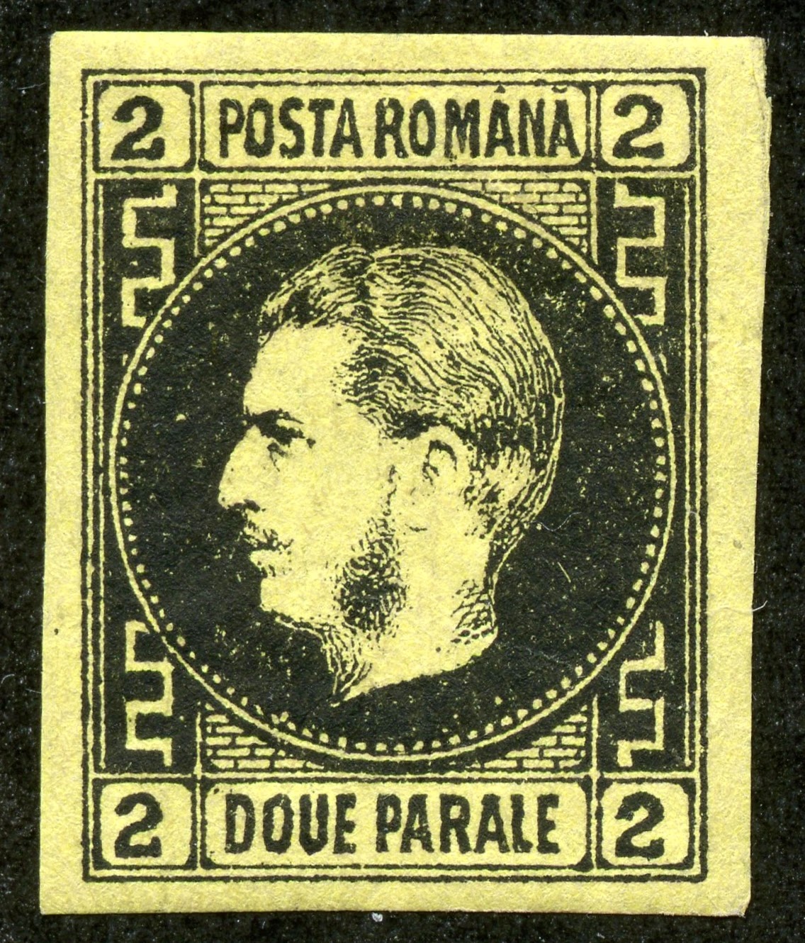
1867 Scott 29 2pa black/yellow "Prince Carol"

Quick History
The Principalities of Moldavia and Walachia became effectively united in 1859 through the election of the same Prince or Domnitor, Alexandru loan Cuza. He was a patriot during the 1848 Moldavia and Wallachia revolutionary efforts and "national awakening", and strongly advocated for the union of the two principalities.


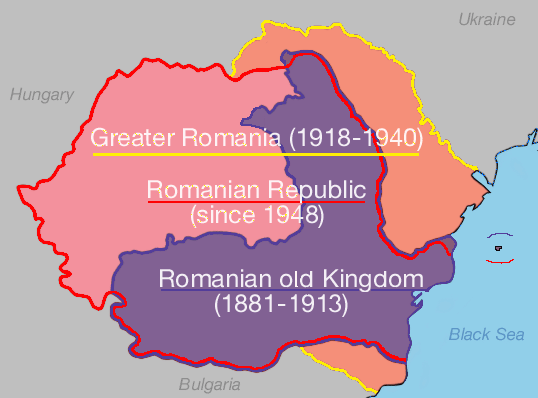
The United Principalities of Wallachia and Moldavia 1859-62
Romanian United Principalities 1862-66
Romania 1866-81
Romania remained a de jure vassal of the Ottoman Empire from 1859-77. But following the 1877-78 war of independence, Ottoman rule, such as it was, ended.

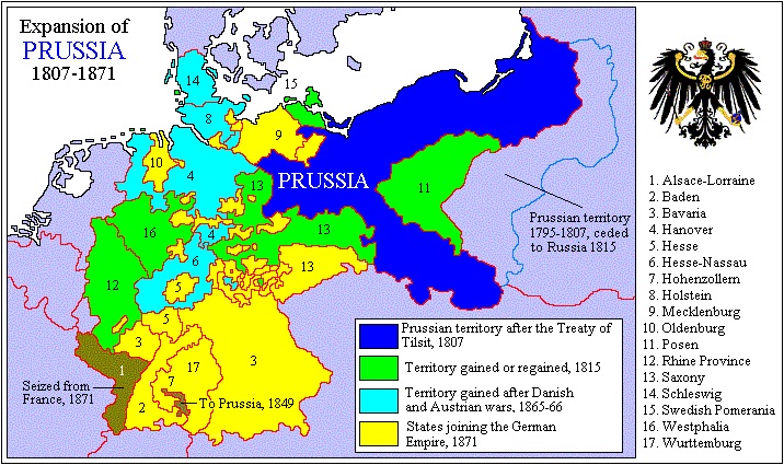
In 1866, Cuza was deposed, and Prussian Prince Carol of Hohenzollern-Sigmaringen was elected- supported by Prussia.

The capital was Jassy (lasi) and Bucharest (1859-62), and then Bucharest (1862-1881).

The population was 5,300,000 in 1880.

A hereditary constitutional monarchy was established in 1866. In 1881, Romania's parliament declared the country a kingdom, and Prince Carol I became King Carol I.

To be continued .....

1868 Scott 36 18b scarlet "Prince Carol"
Into the Deep Blue
The 2011 Scott Classic Specialized 1840-1940 catalogue has, for Romania 1858-1942, 931 major number descriptions. Of those, 545 are CV <$1-$1+, or 59%. The earlier Romania, though, is fairly expensive through 1880 (74 major numbers). The more modern Romania is quite inexpensive.

Romanian stamps are fascinating, but unfortunately, most of the earlier issues have been counterfeited, some extensively. Varro Tyler, in his book "Focus on Forgeries- c2000", devotes 10 pages to the forgeries of Romania!

If you wish to delve further into the attractive issues of this country, there is a wonderful web site resource.

http://www.romaniastamps.com/

I plan to publish three blog posts for Romania. This post will examine the 1858-1880 issues. The next submission will cover the 1885-1926 stamps. And finally, I will review some specific forgeries.

A closer look at the stamps and issues
40 Parale = 1 Piaster
100 Bani = 1 Leu (plural "Lei") (1868)
1864 Scott 21 30pa deep blue 
Moldavia-Walachia "Coat of Arms"
The first issues for the region were the handstamped "Bulls" stamps for Moldavia in 1858 and 1858-59 respectively. The design has a small star over a bull head above a posthorn, The ten Scott major numbers are expensive ($100+-$25,000), forgeries need to be ruled out, and I don't have any. ;-)

The Moldavia-Walachia issues (11 stamps) were produced in 1862 (Printed by hand from single dies) and 1864 (Typographed). I show a copy of the typographed 1864 three stamp issue here. CV ranges from $10+-$60 for the 1864 issue.

Moldavia Coat of Arms
The Moldavia-Walachia issues combine the "Coat of Arms" of the two principalities. Moldavia featured a "Bull".

Walachia Coat of Arms
Walachia has had a raptor (eagle) on it's seal since at least 1390.

1864 5pa "Prince Alexandru loan Cuza"
Never placed in use
The first  issue, with "Romana" inscribed, was this design on three stamps produced in 1864- but never placed in use, according to Scott. CV (set) $9. It has, appropriately, Prince Cuza's vignette, the man most responsible for uniting the two principalities.

1865 Scott 23 5pa blue "Prince Alexandru loan Cuza"
A three denomination lithographed set was issued in 1865. CV ranges from $35 - $70.

Counterfeits can be found- refer to http://www.romaniastamps.com/forg/forgeframe.htm for specifics.

(In fact, all the early Romanian stamps were counterfeited. Caveat Emptor. )

1865 Scott 24 & Scott 25 20pa red
Type I & Type II
The 20pa red is found in two types. In Type I, the central oval does not touch the frame below, and the "I" of DECI is elongated. In Type II, the central oval touches the frame below, and the "I" of DECI is the same length as the other letters.

1867 Scott 31 20pa black/rose "Prince Carol I"
Type I
When Prince Cuza was forced to relinquish his post- apparently he pleased neither the liberals or conservatives- Prince Karl of Hohenzollern-Sigmaringen was elected on April 20, 1866- backed significantly by Prussia. He was Prince (Domnitor), then King (1881) until 1914.

A four stamp set was issued for Prince Carol in 1866-67. Thick paper (minor numbers) was used in 1866, thin paper in 1867.

CV is $30-$60.

Of interest, the 20pa black/rose can be either found as Type I (Border at upper right goes from right to left), or Type II (Border at upper right goes from left to right).

Prince Karl of Hohenzollern-Sigmaringen 
When the Ottoman Empire was defeated in 1878 (Russo-Turkish War), Prince Carol declared the country independent- they had been under nominal control of the Ottoman Empire until then.

He became King of Romania in 1881, and his Hohenzollern-Sigmaringen lineage ruled until 1947.

He apparently was a rather meticulous and cold person, and liked to wear his crown to bed.

He never produced a male heir (a daughter died at age three),  His brother Leopold was next in line for the throne. But Leopold relinquished his right in 1880 to his son William, who, in turn, surrendered his right in 1886 to his younger brother, Ferdinand. Ferdinand eventually became King from 1914-1927.

1870 Scott 34 3b violet "Prince Carol"
A four stamp set was issued between 1868-70 with the illustrated design. CV $30-$47+.

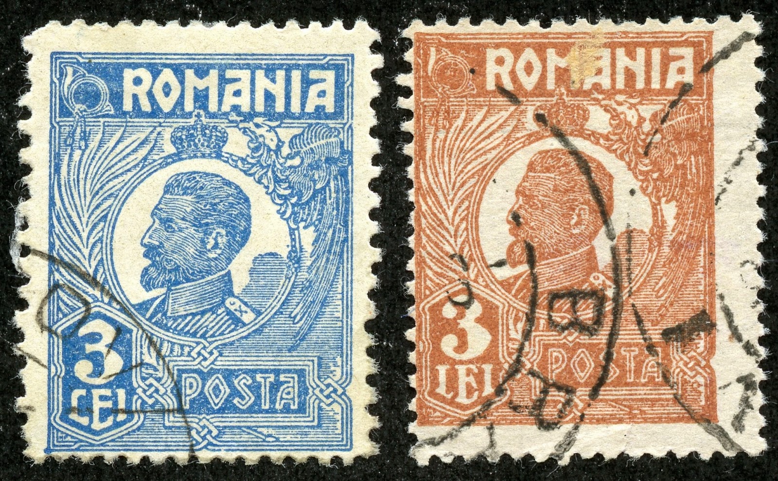
1869 Scott 41 25b orange & blue
A different design for the frame resulted in a five stamp issue in 1869. The two higher denominations are bicolored. CV is $20+-$50+.

1871-72 Scott 46 15b red "Prince Carol"
Still imperforate, a five stamp issue was released in 1871-72. CV ranges from $35 to a hefty $200+.

1872 Scott 51 & 51a 10b "Prince Carol"
Blue & Ultramarine Colors
The first perforated issue ( Perf 12 1/2) of three stamps was released in 1872. The design is the same as the earlier 1871-72 issue.

I'm showing here two colors for the 10b denomination- blue and ultramarine (minor number).

1872 Scott 59 50b rose/pale rose "Prince Carol"
Paris Print, Fine Impression; Perf 14 X 13 1/2
Resembling French stamps- no doubt because they were designed and printed in Paris- a new 1872 typographed seven stamp issue was developed. This release is on tinted paper, has fine impressions, and is found Perf 14 X 13 1/2. CV is $4+-$40+.

1876 Scott 61 5b bister/yellowish
Bucharest print, Rough Impression; Perf 11
The plates then were brought to Bucharest, where "rougher" impression stamps were produced. The 1876-79 issue had five stamps, and, importantly, are found with perforations 11, 11 1/2, 13 1/2, and compound. It is fairly easy to differentiate the Paris and Bucharest printings on perforations alone.

1879 Scott 72 50b bister/yellowish
More Bucharest "rougher impression" stamps were released in 1879 with the same perforations as the 1876-79 issue. There are seven stamps, and the colors for the same denomination are different from the 1876-79 issue.

1880 Scott 74 25b blue "King Carol I"
Finally, a two stamp issue was produced in 1880 on the cusp of Romania becoming a kingdom and Carol trading in his "prince' title for "king".

You may have noticed that, for the early perforated issues for Romania, the perforations often cut into the design. For this issue, the Scott's CV ($2+-3+) is for the grade of "fine".

Deep Blue
Romania 1868-70 Issue in Deep Blue
The Deep Blue (Steiner) album has 76 pages for the stamps of Romania, and has a space for all the major Scott numbers.

1869 Scott 42 50b blue & red "Prince Carol"
Big Blue
Big Blue '69, on 19 pages, has 530 spaces for the stamps of Romania. Coverage is 57%.

Observations....
* There are 18 stamps with CV over $10, with six @ CV $35- $60 (Most Expensive Stamps category).

* Of interest, BB specifies (through image cut), Scott 32 20pa black/rose-Type II- "The Greek border at the upper right goes from left to right", rather than Scott 31 Type I "The Greek border at the upper right goes from right to left". Both have the same CV ($20+), but I have five copies of Type I in my collection, and none of Type II. :-(

* There are some curious omissions. The 1930 Scott 353-357 "Michael Type of 1928" issue is left out. And the Postage Dues have spaces for the 1911 issue, but not the 1919,1920,1920-26, and 1923-24 issues consisting of 24 stamps, all of them close to minimum CV.

* Semipostals are generously represented. Of the 150 semipostals in the catalogue, BB has 139!

Checklist

1862-63 (Actually- 1864)
20+,21+,

1865
22 or 26,23 or 27,24 or 25,

1866
29,32*,

1872-78
53 or 60,61,56,64,58,59,

1879
66,67,68,69,70,71,72,

1880
73,74,

1885-89
75 or 88,76 or 81 or 89,83,77or 90,91,78 or 92,79,87,

1890-94
94 or 101,95 or 102a or 102,96 or 103,
97,98,99 or 106 or 115,100 or 107 or 116,

Next Page

1894-1901 (actually 1893-)*
117 or 132 or 148, 118,119 or 135 or 149, 120,122,124,126,
128 or 142 or 154,129 or 143 or 155,130 or 144 or 156,131 or 146 or 157,
121 or 136 or 150,123 or 137 or 151,125 or 138 or 152,127,

1901-02
133,139,

1903*
158,159,

1903-05
134,140,145,

1906
176,177,178,179,180,
181,182,183,184,185,

Next Page

1906
186,187,188,189,190,191,
192,193,194,195,
196,197,198,200,

1908
207,208,209,210,211,213,215,216,

1908-18
217,218,219,220,222,223,212*,

Next Page

1913
230,232,233,234,231,

1918
241,242,

1919
245,246,247,248,249,

1919
250,251,252,254,255,256,258,

1920-25
261,262,264,266,267,268,269,
270,271,272,274,277,279,281,

1922
283,284,285,286,288,287,

Next Page

1926
291,292,293,294,295,296,

1927
308,309,311,312,
313,316,318,319,

1927
310,314,

1928
320,322,

1928-29*
321,323,324,325,326,327,328,

1928
329,330,331,332,

Next Page

1928
336,337,338,340,

1928
341,
           
1929
347, 352,
348,349,350,351,

1930*
359 or 368,360,361,363,364,365,362,
366 or 368A,362A,380,381,382,383,
369 or 405,370,371 or 407,372 or 408,373 or 409,374 or 410,375 or 411,

Next Page

1930
376 or 412,377 or 413,378,379 or 414,

1931
384,386,

1931
385,387,388,389,390,
391,394,395,392,393,400,

1931
396,397,398,399,415,

1931
403,

1932
417,418,419,

1932
421,422,423,424,425,426,427,

Next Page

1933-34
429,430,431,432,
433,434,435,436,
437,438,439,440,441,

1935-40
442,443,444,445,
446,447,448,449 or 449A,450,450A,
451,452,453,454,455,456,

Next Page

1935-40
457,458,459,460,

1937
467,468,

1937-39
463,464,465,466,
473,474,472,470,471,
477,479,480,481,482,
483,484,485,486,488,

Next Page

1939-40
489,490,493,494,
495,496,497,498,
491,492,504,505,
506,507,508,509,510,511,512,

Next Page

Semi-Postal
1906
B1,B2,B5,B6,B7,
B13,B14,B15,B16,B9,

1906
B10,

1927
B21,B22,B23,B24,B25,

1907
B17,B18,B19,B20,

1931
B26,B28,B27,B29,B30,

Next Page

Semi-Postal
1931
B31,B32,B33,B34,B35,B36,

1934
B44,B45,B46,B47,B48,B49,

1932
B37,B39,B38,

1934
B41,B43,

1934
B42,

1935-36
B52,B54,B50,B51,

1935-36
B53,B56,B57,B61,B58,

Next Page

Semi-Postal
1936
B59,B62,B60,B63,B64,B65,
B66,B67,B68,B55,

1937
B69,B70,B71,B72,B75,
B73,B74,B76,B77,B78,

1937
B79,B80,B81,

1938
B94,B97,B98,

Next Page

SemiPostal
1938
B95,B96,B83,B84,B85,
B86,B87,B88,B89,B90,B91,
1938
B92,B93,B82,

1939
B99,B100,

1939
B101,B102,B103,B104,B105,B106,
B107,B108,B109,

1940
B113,B114,B116,

Next Page

Semi-Postal
1940
B115,B117,B118,B119,B120,B121,
B122,B123,B124,B125,B126,
B145,B127,B129,B130,
B128,B131,B132,B133,B134,
B138,B139,B140,B141,B142,B143,B144,

Next Page

Occupation Stamps
1917
1N1,1N2,1N3,1N4,1N5,1N6,

1918
1N18,1N19,1N20,1N21,1N22,1N23,
1N24,1N25,1N26,1N27,1N28,1N29,
1N30,1N31,1N32,1N33,1N34,

1916
2N1,2N2,2N3,2N4,

1918
3N8,3N9,3N10,

1918
3N11,3N12,

Offices in the Turkish Empire
7,8,9,

Next Page

Air Post
1928
C1 or C4,C2 or C5,C3 or C6,

1930
C13,C14,C15,C16,

1931
C17,C18,C19,C20,

Semi-Postal Air Post
1940
CB1,

Next Page

Postal Tax
1916
RA3,RA5,

1921-24
RA13,(RA14 or RA15),

1931
RA16,RA17,RA18,

1932
RA19,RA20,RA21,

1937
RA22,RA23,RA24,

Next Page

Postal Tax Due
1915
RAJ1,RAJ2,

1916
RAJ3,RAJ4,

1922
RAJ12,RAJ13,

Postage Due
1881-1911
2 Bani: J1 or J9 or J14 or J18 or J24 or J30 or J36
Four blank spaces: (J1-J40 except for postage due number used for 2 Bani)

1911*
J41,J42,J43,J44,J45,J46,J47,

1932-37
J83,J84,J85,J86,

Parcel Post
1895-1911
Q1 or Q3 or Q6,Q2 or Q4 or Q5,

Official Stamps
1929
O1,O2,O3,(O4),(O5),(O6),(O7),

1931-32

O25 or O29,O26,O27 or O31,O28 or O32,O33,

End

Comments
A) Expensive stamps ($10 threshold):
1864 Scott 20+ 6pa deep rose ($20+- (there are several other much more expensive choices also)
1864 Scott 21+ 30pa blue ($10+ - (there are several other much more expensive choices also)
1865 Scott 26 2pa orange ($60)
1865 Scott 23 5pa blue ($45)
1865 Scott 64 (TI) or Scott 65(TII) 20pa red ($35)
1866 Scott 29 2pa black/yellow ($35)
1866 Scott 32 20pa black/rose ($20+)
1872 Scott 58 25b orange/pale buff ($10+)
1872 Scott 59 50b rose/pale rose ($42+)
1879 Scott 67 3b olive green/bluish ($10+)
1879 Scott 70 15b rose red/yellowish ($10+)
1879 Scott 71 25b blue/yellowish ($20+)
1879 Scott 72 50b bister/yellowish ($35) 
1885-89 Scott 87 50b bister/pale buff ($20+)
1891 Scott 107 50b orange ($10+)
1906 Scott B7 10b (+10b) carmine ($10+)
1932 Scott B36 6l + 6l black brown ($10+)
1934 Scott B49 6l + 6l black brown ($10+)
B) *32 BB's illustration cut specifies Scott 32 -Type II- "The Greek border at the upper right goes from left to right", rather than Scott 31 Type I. !!
C) *1894-1901 (actually 1893-)- Choices do not include 1911- 19 Scott 224-229 "Types of 1893-99".
D) *1903- counterfeits abound!
E) *212- an A44 design, while the rest of the row is an A46 design!
F) *1928-29- choices do not include smaller 1930 Scott 353-357 "Michael Type".
G) *1930 - Choices are because of different watermarks (wmk 225 vs wmk 230).
H) *1911- Postage due choices do not include the 1919,1920,1920-26, and 1923-24 issues!
I) (    ) around a number indicates a blank space choice.

1879 Scott 68 5b green/bluish "Prince Carol"
Out of the Blue
I really like the early stamps of Romania, and if I ever concentrated (specialized) my interests, Romania would be a prime candidate. ! Of course, one would need to become well acquainted with forgeries also. ;-)

Note: Map, image pics appear to be in the public domain.

Comments appreciated!

Romania 1885-1926

$
0
0
1885-89 Scott 84 10b rose/pale buff "King Carol I"
Quick History
Karl of Hohenzollern-Sigmaringen, well placed with relatives in both the Prussian ruling family and the French Bonaparte family, became King of Romania in 1881 after fifteen years as the Romanian Prince.

Romania, during this period, was heavily influenced by French culture, which clearly is reflected in the stamp designs.

 Purple: Kingdom of Romania (1881-1913)
Orange: Territory added after Second Balkan War & WWI, but lost after WW II
Rose: Territory added after WW I
The "Old Kingdom" lasted until the Second Balkan War and WW I, when King Carol I died in 1914, and Greater Romania acquired new lands ( Southern Dobruja, Transylvania, Banat, Bessarabia, Bukovina) as spoils of war.

Since territorial gain/loss is a zero sum game, read  about the dismantling of the Austro-Hungarian Empire here....


Historical Regions of Greater Romania 1918-40
Greater Romania, between 1918-40, enjoyed excellent economic growth, and advanced to second in Europe in both oil and food production.

1900 Scott 143 50b orange "King Carol I" 
Into the Deep Blue
This is the second of three blog posts on Romania, and I will cover the stamp issuing years of 1885-1926 here.

A closer look at the stamps and issues
40 Parale = 1 Piaster
100 Bani = 1 Leu (plural "Lei") (1868)
1885-89 Scott 76 3b violet (White paper)
1885-89 Scott 81 3b violet/bluish (Tinted Paper)
Between 1885-89, a five stamp issue on white paper, and an eight stamp issue on tinted paper was released. Of interest, Scott gives the different papers all major numbers. There was also a six stamp issue on thin pale yellowish paper with watermark 163 "Coat of Arms" released in 1889.

1890 Scott 99 25b gray blue , Wmk 163
The 1890 seven stamp issue with this design  also had the "Coat of Arms" watermark.

Wmk 163 "Coat of Arms"; Wmk 164 "PR"
Here is a pic of the "Coat of Arms" and "PR" watermarks.

1891 Scott 107 50b orange, Unwmk
In contrast, the 1901 seven stamp issue, with the same or slightly different colors compared to the 1890 issue,  had no watermark. Yes, watermarking this design will be necessary. ;-)

1891 Scott 112 15b gray brown
25th Year of the Reign of Carol I
A five stamp issue was produced in 1891 without watermark to celebrate the 25th year reign of Carol I as Prince (1866) and King (1881).

In 1894, four more stamps were issued, several in similar colors, but with watermark "PR".

Forgeries have been produced for this issue.

For a genuine specimen, look at the horizontal shading lines inside the vignette oval. The uppermost line is thicker in the middle and tapered at both ends. The lowest shading line is curved upwards at one or both ends.

In contrast, a common forgery has short straight shading lines of the same thickness as the other shading lines for the uppermost and lowest lines, according to Varro Tyler (Focus on Forgeries -2000).

(For those using- "Focus on Forgeries "c2000- be aware that the illustrations for the genuine vs forgery is mistakenly switched for this issue.)

1893 Scott 117 1b pale brown, "Bani" script
A new design issue was released between 1893-98 on 15 stamps, and has watermark "PR" (Wmk 164 & Wmk 200, -Wmk 200 is a variation on "PR" script).

1893 Scott 131 2 l orange & brown
The 1893-98 stamps are bicolored for the two highest denominations.

1901 Scott 133 1b brown, "Ban" script
Using the same design, but on unwatermarked paper, another 16 stamp issue was released between 1900-03. Some stamps have the same color as the 1893-98 stamps, and some have different colors

Scott states this issue is characterized by thin paper, and tinted rose on back. I did not appreciate the distinction much, finding the unwatermarked state of the paper more helpful.

Note the 1900-03 issue has both "bani" and "ban" script stamps for the 1b denomination.

1903 Scott 147 2 l red brown & black
Like the 1893-98 issue, the 1900-03 issue has bicolors for the higher denominations.

Be aware that, besides the 1893-98 and 1900-03 issue, there is a ten stamp 1900 wmk 167 "Coat of Arms covering 25 stamps" issue, and an unwmk 1911-19 six stamp "Types of 1893-99" issue with the same designs. All in all, these issues require attention to color, paper, and watermarks for proper identification.

1906 Scott 185 2 l orange & black
"King Carol I at Shrine of St. Nicholas"
40 Years Rule of Carol I as Prince and King
The year 1906 was the 25th anniversary of the Kingdom and the 40th year of rule for Carol I. Naturally, stamps marked the occasion.

A lovely engraved ten stamp bicolored issue was released for the 40 years of rule for Carol I as prince and king. The issue has various scenes of his official life.

1906 Scott 181a 25b olive green & black
"Romanian Army Crossing Danube"
Scott 181a never placed in use
Ultramarine & black is the nominal color for the 25b denomination. But an olive green & black color, albeit never placed in use, can be found be collections.

1906 Scott 191 25b ultramarine & black "King Carol I"
25th Anniversary of the Kingdom
A 10 stamp set for the 25th anniversary of the Kingdom was also released in 1906. CV ranges from <$1-$1+ for nine stamps.

King Carol I
Carol I was an able commander, and led the Romanian troops during the Russo-Turkish War.


1906 Scott 206 3 l brown orange & brown
"Queen Elizabeth (Carmen Sylva)"
Another eleven stamp issue was released in 1906 for the General Exposition. These stamps were only available July 19-31, 1906, and only valid for those dates! But the remainders were sold privately by the promoters of the Exposition. The CV for the lower denominations is $1+-$3, but the three highest denominations are CV $25-$42+. These higher denominations (1.50l, 2.50l, 3l) have also been forged.

The 3 l brown orange & brown (shown above) shows a small cross on the queen's crown in the genuine specimen. The forgery has a "blob" for the cross, according to Varro Tyler (Focus on Forgeries -c2000).

Of interest, Queen Elizabeth (Elisabeth of Wied) never delivered a male heir.

1908 Scott 211 40b bright green 
Engraved; Various Shades
Between 1908-18, a 10 stamp engraved issue was produced. Here I show that, in my accumulation of 40b "bright green" stamps, there are, at least, three shades. ;-) I don't know if these shades are "real", or merely chemical changelings.

1909 Scott 220 10b rose
Typography
Also, between 1909-18, a seven stamp typographed issue was produced. The vignette differs (A46), mainly by the ultra-long beard, compared to the 1908-18 (A44, A45) set.

1919 Scott 227 50b dull red
Types of 1893-99
Remember I mentioned before about a "Types of 1893-99" 1911-19 set? Well, here it is. ;-) The six stamp set is on white unwatermarked paper. The set is also in different colors compared to the earlier issues.

1913 Scott 237 50b yellow & blue 
"Romanian Crown and Old Fort on Danube"
Romania's Annexation of Silistra
The Second Balkan War (June 28, 1913-July 13, 1913) resulted in Bulgaria losing additional territory, and Romania obtaining southern Dobruja and Silistra. (Refer to prior illustrated map.)

A ten stamp issue was released December 25, 1913 celebrating the annexation.

1918 Scott 241 5b yellow green, Overprinted in Black
Genuine, Forgery, Forgery
In 1918, a two stamp overprinted issue was released. The overprint was produced by typography. And, naturally, numerous overprinted forgeries also exist, even though the CV is <$1. Varro Tyler (Focus on Forgeries c2000) discusses some of the genuine and forgery characteristics.

The left stamp probably is genuine, as the lines in the rope are thin and clearly printed- and the looped portion of the "1" is oval. The center stamp has the looped portion of the "1" round, and is a probable forgery. Th right stamp appears to have a crude handstamp: a forgery.

1919 Scott 245 1b black, Red overprint
Recovery of Transylvania and the return of the King to Bucharest
Ah, the territorial spoils of WWI! (And, in this case, vampires and Dracula! ;-)

Hungary (in various forms) had actually occupied Transylvania since the 10th century. But Hungarian, Romanian, and German speaking peoples could all be found there.

But after WWI, Austria-Hungary collapsed, and the ethnic Romanians of Transylvania declared unity with Romania on December 1, 1918.

1,600,000 Hungarians ended up inside the borders of Romania. !!

Three stamps were overprinted in 1919 for the "Recovery of Transylvania".

1920 Scott 254 40b gray brown "King Ferdinand"
White paper & Coarse paper varieties
The 1920-22 issue of thirteen stamps is found with either white or coarse grayish paper. The Scott catalogue, though, has not created any minor numbers for the paper varieties.

King Ferdinand had been king since October 10, 1914, but only in 1920 is there a stamp issue with his portrait produced. Ferdinand had been the heir-presumptive to the throne of his childless Uncle Carol I since 1886, as his father (1880), and  his brother (1886) had both renounced their rights.

Ferdinand's coronation didn't occur until October 15, 1922 at the historic princely seat of Alba lulia, in Transylvania.

1920-26  2 l light green "King Ferdinand"
Scott 271a (Type I), 271 (Type II), 271b (Type III)
The 1920-26 issue has 22 major number descriptions. Of interest to WW classical collectors are the 2 l, 3 l, and 5 l denominations, which can be found with different numeral types. Some types are major numbers, some types are minor numbers.

Shown above are the three "2" numeral types. Scott has illustrations and descriptions for all the types.

1920-26 Scott 272 3 l blue (Type I); Scott 273 3 l buff (Type II)
The 3 l numeral is found in two types.

1920-26 5 l light brown & brown
Scott 277a ( Type I); 277 (Type II)
And the 5 l numeral is also found in two types.

Deep Blue
1906 Issue in Deep Blue
All the major numbers are represented in the Deep Blue (Steiner) album. But there are no spaces for the minor number numeral types found for the 1920-26 (Scott 261-282) issue. And certainly the 1920-22 (Scott 248-260) issue with two paper types, not the least because Scott does not even give them minor numbers, do not have a space. Extra/quadrilled pages may be needed.


1906 Scott 180 15b dull violet & black
"Carol I as Prince in 1866 and King in 1906"
Big Blue
The Big Blue checklist and comments for Romania are found in the 1858-1880 blog post.

The '69 and later edition BBs have the same coverage as the 1940s editions, except the '69 and later editions include 1872-78 Scott 59 50b rose on pale rose (CV $42.50!), and 1879 Scott 70-72.

1906 Scott 204 1.50 l red lilac & black brown "King Carol I"
Genuine: Two vertical lines in Shako Plume; Forgery: One thick irregular line
Out of the Blue
I continue to be enamored with Romanian stamps- can you blame me? ;-)

Note: King Carol I pic and maps appear to be in the public domain.

Have a comment?

Romania and Forgeries

$
0
0
Forgery 1903 Scott 164 40b dull green 
"Mail Coach leaving Post Office"
Into the Deep Blue
Without a doubt, the WW classical era collector will have some forgeries in their Romania collection.

Fortunately, there is help.

One of the best, if not the best, stamp websites focusing on a philatelic country is available for Romania.

http://www.romaniastamps.com/

There, one will find comparison illustrations and descriptions for genuine/forgery stamps.

Ah, if a site like this was available for all countries/major collecting areas with an emphasis on forgeries, what a wonderful "world" it would be for us naive lambs that do indeed collect the world. ;-)

Another helpful resource is Varro Tyler's book- "Focus on Forgeries c2000", which has 10 pages for Romania.

And presented here are some of the common forgeries in my own collection.

1903 "Mail Coach" Issue - Genuine
The 1903 eight stamp (Scott 158-165) "Mail Coach" issue was intended to help commemorate the opening of a new main Post Office in Bucharest.  The issue is on thin "tinted rose on face" paper, with perforations 14 X 13 1/2.

It is a lovely striking design.

1903 "Mail Coach" Issue - Forgeries
But Scott has a note: "Counterfeits are plentiful"- and, are they ever! ;-)

Varro Tyler states there are actually two forgeries- the common one shown here is called "Type I", and is apparently the work of the E. Cote printing firm in Paris. Tyler also comments that the Type I forgery is so common, it probably outnumbers genuines.

Let's take a closer look....

Genuine 1903 Scott 159 3b brown violet
"Mail Coach leaving Post Office"
There are three good signs that help distinguish a genuine.

Genuine: Horse Forefoot touches Whiffletree
The most obvious (to me) is the horse's forefoot touches the whiffletree in front in the genuines, which is not the case for the Type I forgeries.

Genuine: Rider's Hat Sign
On the rider's hat, there are two feathers. The left, longer, and lower feather is definitely attached to the hat, while the right shorter feather does not touch the hat or the lower feather (or just barely).

Genuine: Ball is attached at the top of left Stairway Rail
The left ball at the top of the stairs on the rail is definitely attached to the rail.

Forgery 1903 Scott 162 15b black
Now, let's look at the common Type I forgery.

Forgery: Horse Forefoot does not touch Whiffletree
For Type I, the forefoot and whiffletree do not touch. 

Forgery: Rider's Hat Sign
The feathers on the hat form a "V", and they do not (or just barely) touch the hat itself.

Forgery: Ball is floating above the left Stairway Rail
The left ball at the top of the stairs is not attached to the railing in the Type I forgery.

1932 Scott 428 16l blue green
"Mail Coach Type of 1903"
Be aware there there was also a 1932 Scott 428 16 l blue green stamp issued for the 30th anniversary of the opening of the new Post office in Bucharest.

It resembles a bit the description for the much scarcer cruder Romanian origin Type II forgery- " Horse forefoot and wiffletree touch each other, and the hat feathers resemble a "Y" that is firmly attached to the hat".

Genuine: 1906 Semi-postal "Queen Elizabeth Spinning" Issue
The 1906 four stamp semi-postals "Queen Spinning" issue (Scott B1-B4) is rather stunning in design.

Genuine: 1906 Scott B2 5b (+10b) light green
"Queen Elizabeth Spinning"
The insatiable packet trade needed stamps, and Belgium source forgeries were produced.

But the forgeries are easily distinguished- let's take a look.

Genuine: a Hyphen between "Romania" and "Posta"
The genuines have a hyphen between "Romania" and "Posta". In addition, the top portion of the "R" in the "Facere" script is small, and the top of the "S" and "T" touch the border.

Forgery: 1906 Scott B2 5b (+10b) light green
The forgeries have an obvious mistake. Do you see it?

Forgery: No Hyphen between "Romania" and "Posta"
There is no hyphen! And note the top portion of the "R" in the "Facere" script is large, and the top of the "S" and "T" do not touch the border.

Genuine: 1906 Semi-postal "Queen Elizabeth Weaving" Issue
The "Queen Weaving" semi-postals of 1906 (Scott B5-B8) are illustrated here.

Genuine: 1906 Scott B6 5b (+10b) blue green
"Queen Elizabeth Weaving"
This issue was also forged by the Belgium group.

Genuine: Right innermost vertical frame line
does not touch horizontal frame line below
Note the characteristic sign for the genuine illustrated here. In addition, the left inner vertical frame line continues in-between the laurel leaves.

Genuine: Face and Lattice
The latticework is finer and more complete.

Forgery: 1906 Scott B6 5b (+10b) blue green
Now, let's take a look at the forgery....

Forgery: Right innermost vertical frame line
does touch horizontal frame line below
Note the sign above. Also the left inner vertical frame line does not continue in-between the laurel leaves.

Forgery: Face and Lattice
The latticework is crude, and the face likewise.

Out of the Blue
I must admit I enjoy forgeries- especially the more common ones found distributed through the packet trade.

But it is only enjoyable if one can identify them. ;-)

Have a comment?

Ile Rouad (Arwad Island)

$
0
0
1916 Scott 11 1pi on 25c blue
Stamps of French Offices in Levant
1902-06, Overprinted Horizontally
Quick History
Ile Rouad (Arwad Island) is located in the Mediterranean Sea just 2 miles off the coast from Tartus, south of Latakia, Syria. But on September 1, 1915, it was occupied by French Forces, and served as a staging ground for incursions into the Ottoman territory (Damascus 1918).

Ottoman Empire before WW I (Red-brown)
The island (known as Ruad) had likewise served as a staging ground during the Crusades of the 13th century.

Location of Ile Rouad
The island is quite small (800 meters X 600 meters), and today the fishing town of Arwad with a population of 4,000 people fills the entire land.

View of Ile Rouad (Arwad) 1935
In 1919, the island became part of the French T.E.O ( Territorires Ennemis Occupes), and the stamp issues of French occupied Syria were used.

French Syria 1924
On September 20, 1920, Ile Rouad was absorbed into the Alawite State ("Alaouites").

For subsequent history, see my postings on Alaouites and Latakia.

For a nice overview, check out Michael Adkins's Dead Countries Stamps and Banknotes.

1916 Scott 5 2c lilac brown 
Stamps of French Offices in Levant, 1902-06
Overprinted Horizontally
Into the Deep Blue
The 20111 Scott Classic Specialized 1840-1940 catalogue has, for Ile Rouad 1916, 16 major descriptions. Of those, 8 are CV $1+-$2+, or 50%. Of interest, Scott has used and unused at the same CV for the horizontally overprinted stamps, although I suspect genuine used stamps are scarcer.

A post office was opened up on Ile Rouad in early 1916.

The initial issue had three stamps with a vertical overprint using the stamps of the French Offices in the Levant, 1902-06. Scott states the stamps were first issued January 12, 1916, but other sources have April 5. This was a speculative handstamped overprint instigated by the stamp dealer Felix Cohen. The CV today is $250 for each of these. Scott has a note that dangerous counterfeit overprints exist for this vertical overprint issue.

A closer look at the stamps and issues
25 Centimes = 1 Piaster
1916 Scott 4 1c gray
Stamps of French Offices in Levant, 1902-06
Overprinted Horizontally
The horizontally placed "Ile Rouad" overprint stamps on the 1902-06 French Offices in the Levant issue arrived November, 1916.

The issue consists of 13 Scott major descriptive numbers, and the CV is $1+- $4+ for 10 stamps.

1920 Scott 4b 1c slate color variation
Anybody who collects this well known French design has come across color variations for the 1c. Here the slate is shown.

1918 Scott 4a 1c gray, Grayish paper
(G. C. "Grande Consommation")
And the grayish paper varieties (G.C.) used during  WW I are here as well.

 1916 Scott 9 15c pale red
As I mentioned, Scott values unused and used at the same price. I would think genuinely used specimens would be scarcer; certainly of more interest.

1916 Scott 9 with Postmark emphasized
Using the University of Utah web site retroReveal, I tried to get a better view of the postmark. My best guess is "Port Said", ????? -which is now part of Egypt. Was the stamp and cover cancelled there?  Readers- what do you think?

1916 Scott 11 with Postmark emphasized
I also applied the retoReveal channels to the 1pi on 25c specimen heading this post. Here, I was more fortunate, as I found an example of the postmark with an internet search.

"Ile Rouad"& "Postes Francaises" !!!

Deep Blue
1916 Horizontally Overprinted Issue in Deep Blue
Deep Blue (Steiner) has one page for the modest output of Ile Rouad. All major numbers have a space. Naturally, if one is also collecting minor number color variations, or the wartime G.C. paper issues, one will need additional space.

1916 Scott 6 3c red orange
Big Blue
Big Blue '69 has one line and eight spaces for the stamps of Ile Rouad. Total coverage is 50%- not bad. The '69 edition has the coverage after Romania, and on the same page as Ponta Delgada and Roman States. The 40s editions have the same coverage- eight spaces- after Rhodesia and Roman States.

There are no expensive stamps ($10 or greater)  for Rouad in BB.

Of interest, BB has "2c violet brown" descriptive space, which now is a minor number color ( 1920 Scott 5b). The major number color today is lilac brown. I checked the 1947 Scott, and they have the minor number "violet brown" as the main color. This is another example of BB not being updated to align with the modern Scott catalogue. Of course, the collector may put either the major number or minor number color stamp into the space.

Checklist

1916

4, 5b* or 5, 6,7,8,9,10.(11),

Comments
A) Expensive stamps ($10 threshold): None
B) (    ) around a number indicates a blank space choice.
C) *5b- BB has "2c violet brown", which now is a minor number color ( 1920 Scott 5b). The major number color now is lilac brown.

1916 Scott 7 5c green
Out of the Blue
I love dead countries, the deader, the better. ;-)

Note: Maps and pics appear to be in the public domain.

Have a comment?

Ottoman Built Fortress of Rouad
Used as a prison during the French Occupation

Ruanda-Urundi

$
0
0
1931 Scott 42 50c gray lilac "Cape Buffalo"
Quick History
When German East Africa was occupied, and then dismantled after WW I, the lands were acquired by Belgium ( Ruanda-Urundi), Portugal ( Kionga triangle), with the largest share going to Great Britain (Tanganyika).


Ruanda-Urundi (dark green) and the Belgian Congo ( light green) 1935
Troops from the Belgian Congo had occupied this territory in 1916 during the East African Campaign. The military occupation lasted until 1924, when the territory was mandated to Belgium by the League of Nations.

Ruanda-Urundi
Stamps were introduced in 1924 by overprinting those of the Belgium Congo. (Belgium occupation stamps of 1916-1922 are listed under German East Africa.)

The capital was Usumbura, and the population was 3,700,000 in 1940.

Rwanda and Burundi
Ruanda-Urundi (Also known as Belgium East Africa) remained a Belgium mandate to 1945. It was administered as part of the Belgium Congo, but with separate financial funds. Coffee was the main exploitative economy.

It became a United Nations Trust Territory (administered by Belgium) between 1946-1962. Finally, the territory became the independent countries of Rwanda and Burundi. 

1924 Scott 6 5c orange yellow "Unbangi Woman"
Into the Deep Blue
The 2011 Scott Classic Specialized 1840-1940  catalogue has, for Ruanda-Urundi 1924-1938, 71 major number descriptions. Of those, 58 are CV <$1-$1+, or 82%. Clearly, a Ruanda-Urundi collection is inexpensive for the WW classical collector.

Of interest, the current Scott catalogue for Ruand-Urundi begins with number 6 - what happened to "Scott 1-5"? It turns out those numbers were for 1922 Belgium occupation stamps of German East Africa, and they were moved into the Belgium occupation stamp section of German East Africa in the current catalogue. The 40s editions Scott catalogue had the stamps listed under "Belgium East Africa" as Scott 1-5.

A closer look at the stamps and issues
100 Centimes = 1 Franc
1924 20c olive green "Ubangi Man"
Stamps of the Belgium Congo 1923-26 were overprinted as shown between 1924-26 for Ruanda- Urundi. The eighteen stamp issue has 12 subjects which consists of native portraits and activities. The original Belgium Congo stamps were engraved by the American Bank Note Company of New York, and are lovely indeed.

1926 Scott 10 20c green "Weaving"
The CV for the 1924-26 issue is <$1 for 15 stamps.

1929 Scott 27 15c olive brown "Babuende Woman"
The 1927-29 eight stamp issue used the same designs from the Belgium Congo 1923-27 issue, but overprinted in a wider format, as shown. CV is <$1-$1+.

1938 Scott 37 5c deep lilac rose "Porter"
The signature issue ( for me) is the 1931-38 eighteen stamp production featuring native peoples and scenes. These stamps were engraved in Paris.

1931 Scott 38 10c gray "Mountain Scene"
I suspect this is a revenue cancellation.

1931 Scott 39 15c pale red "Warrior"
The CV is <$1 for all but one stamp.

1931 Scott 41 40c green "Cattle Herders"
The issue has sixteen portraits or scenes, all exquisitely engraved.

1931 Scott 44 75c gray black "Bahutu Greeting"
Names on stamps for native peoples is not always clear, but the general language spoken is part of the Bantu group.

Bantu dialects
There are about 650 Bantu dialect languages. The larger language groups include the Luba (13.5 million), the Zulu (10 million), and the Kikuyu (6 million). The lingua franca today for 140 million people is Swahili.

1931 Scott 45 1fr rose red "Barundi Women"
The Burundi area was an indigenous kingdom for 200 years prior to the arrival of the German colonists. It was inhabited by the Twa, Hutu, and Tutsi peoples. During the Belgium hegemony of Ruanda-Urundi, the Tutsi were favored over the Hutu, which contributed to later political turmoil.

1931 Scott 46 1.25fr red brown "Bahutu Mother"
The Belgians did little to directly educate the indigenous peoples, relying on the Catholic (subsidised) and Protestant (unsubsidised) missionaries.

1831 Scott 53 10fr brown violet "Watusi Warriors"
The Tutsi or "Watusi" warriors were quite impressive to the Europeans. Glenn Kittler, who wrote popular books about Africa, opines....

" For the most colorful and exciting dancing, you must go to Ruanda-Urundi... east of the Congo. Here the ruling tribe is the Watusi, the tallest people in the world. It has been said that these giants are born six feet tall, and when you walk among them you can believe it. Men towering seven or eight feet are a common sight. Women gain height by having their heads bound into conical shape in infancy, then training their thick hair to grow straight up to add a few inches. Beholding these lean, dignified, soft-spoken giants is quite overwhelming--and they know it. "

1924 Scott J3 15c violet
Belgian Congo Overprinted
Postage Due stamps, seven in the issue, were produced between 1924-27. They consisted of overprinted Belgian Congo stamps. CV is <$1.

Deep Blue
1931-38 Issue in Deep Blue
Deep Blue (Steiner) has seven pages for the stamps of Ruanda-Urundi, and all the  major Scott numbers have a space.

1931 Scott 40 25c brown violet "Kraal"
Big Blue
Big Blue '69, on one page, has 31 spaces for the stamps of Ruanda-Urundi. Coverage is 44%. The page is found before the Russia pages. 

Of interest, the 1940s editions coverage- which is the same- is under "Belgium East Africa", and is located between Bechuanaland Protectorate and Belgium.

There are no "expensive stamps": In fact, the highest CV is $1.25 !

Because of the inexpensive nature of Ruanda-Urundi stamps, BB could have added more spaces. I count 26 stamps with CV <$1-$1+ that are not in BB.

Checklist

1924-25
6,7,8,9,11,
13,14,16,15,18,

1931-38
38,39,40,42,

1931-38
37,41,43,44,46,

1934
55,

1937
47,49,

Semi-Postal
1936
B12,B13,B14,

Postage Due
1924
J1,J2,J3,J4,J5,J7,

Comments
A) Expensive stamps ($10 threshold): None

1924 Scott J2 10c deep rose
Out of the Blue
The 1931-38 native peoples and scenes engraved issue is, for me, one of the better issues among all of the WW colonial era output.

Note: Maps appear to be in the public domain.

Comments appreciated!
Viewing all 792 articles
Browse latest View live